Avoiding 3 Common Paint Color Pitfalls
PAINT
-It Still Works Wonders, (when you choose it right!)
After seriously having to look at your home for a couple of years are you feeling a bit overdue for a home update?
Well, the simplest update you can do for the biggest design impact is to update your paint colors. But getting them right (after investing your time and money), can be fraught with color challenges.
So here’s how you can avoid the three most common paint color pitfalls I see people struggling with when trying to choose their color palettes:
My 3 Best Tips
as a True Color Expert
For Picking the Right Paint Colors
#1.
Know Where You Are in The Current Trend Cycle
Don’t get caught adding a popular neutral or color to your walls only to find out it looks dated in a year or two.
This sadly happens all too often to people as they are trying to update their homes. Whether that was for themselves or for resale, but either way, it isn’t where you want to find yourself.
So here’s how to avoid being lured into that dated color trend trap:
Trends Typically Last 10 Years
But the cycles seem to be getting shorter and shorter though I’ve noticed. But find out where you are in the current trend.
They begin to appear gradually in small ways, so it’s not a fixed year they take over, so you may need to approximate a bit. But you’re looking for when it becomes noticeable in rooms designers were creating in your region.
Trends typically start on the East Coast, jump over to the West Coast and then work their way into the middle.
The current white and black trend is a solid three years into its cycle.
So it’s still a good time to get in on it.
In another 3 years, you’d be investing in the last third of a cycle.
And that’s where you DON’T want to be.
Because once a trendy room looks dated, guess what?
It doesn’t look just a few years old (even if it is) …it looks 10 years old!
Because with trends we all know what decade they were popular. Gray and white was THE “must-have” colors for the 2010’s.
So if you stepped into a newly done gray and white room now, you won’t think, “Oh, this looks brand new!”. It’ll be “Oh, this looks 10 years old, guess they didn’t use it much.”
But you will STILL see lots of gray furnishings out there in the marketplace 13 years later!
Why?
People who loved the trend for a decade and are now starting their home updated think it’s still a viable color option because it’s still being sold.
Or they are still requesting it because they’ve had their heart set on it for so long.
So it sorts of creates its own lingering albeit dated cycle you don’t want to get caught in.
Manufacturers are trying to move their last color cycle inventory and enough people are still unknowingly asking for it that I even wonder if some manufacturers still keep making it.
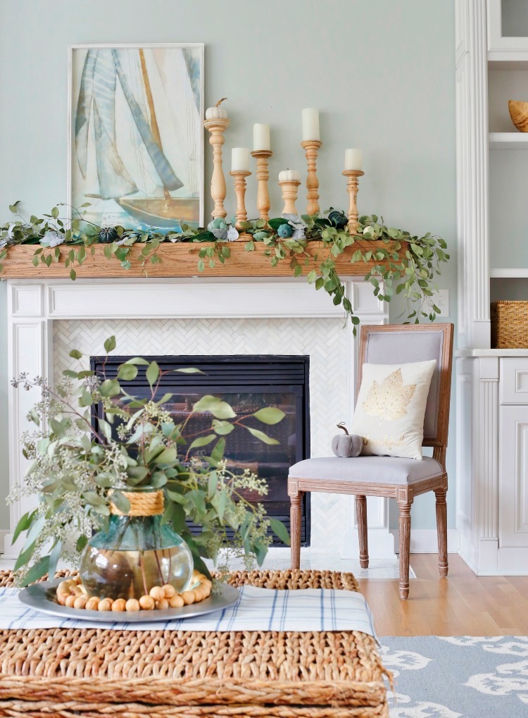
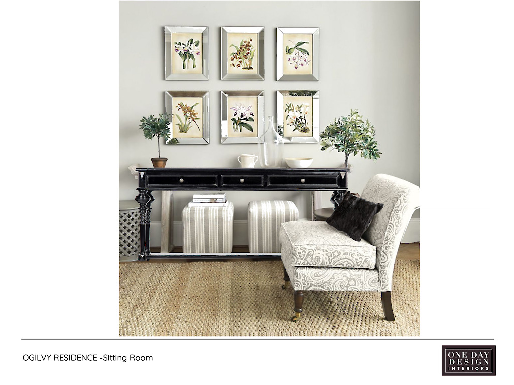
BONUS TIP
Have a lot of gray and white still going on?
If you don’t plan to replace it all, you can slide into the latest black and white trend by adding black accents to your space! Look at the difference it made to the room above…
#2.
Look at What is Staying
(This is THE second most overlooked step)
In the excitement of starting to do updates, it is SO tempting to want to start by looking at all the new possibilities.
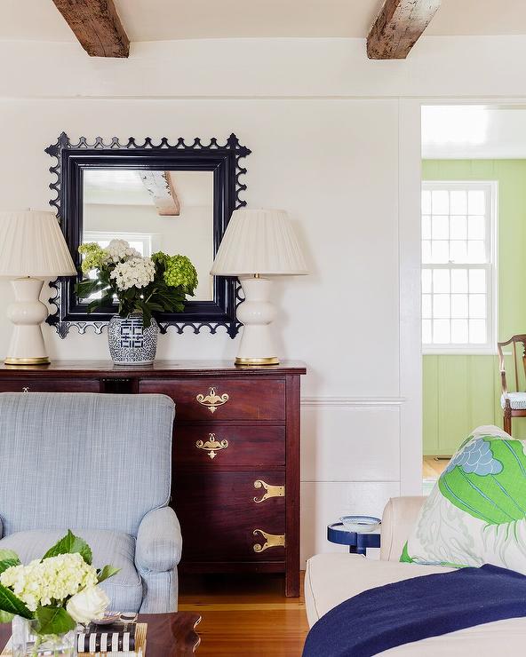
But here’s the thing, especially with choosing updated paint colors, they have to go with everything that is staying.
Like the flooring, fireplace, window treatment, kitchen or bath components. And of course, any furnishings and area rugs you’re keeping.
Even the colors of large artwork and adjoining room you will be able to see into.
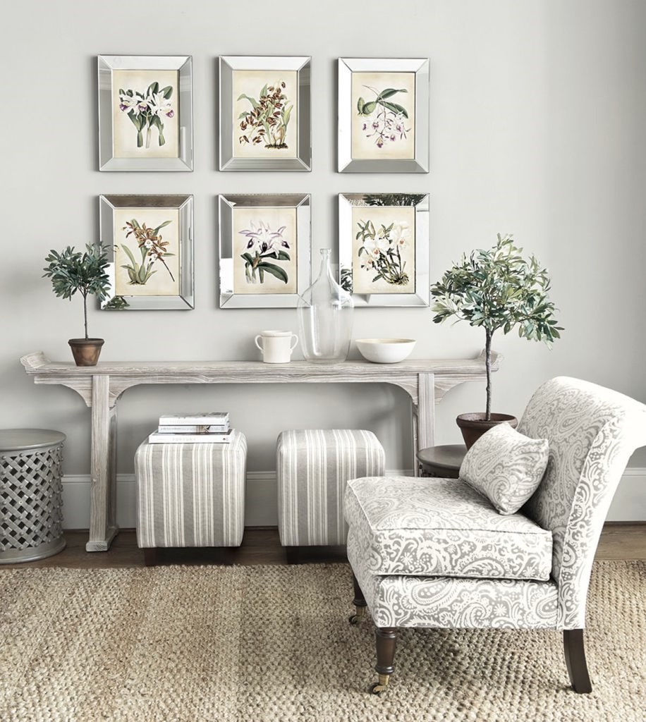
Notice how in the room below, the very warm colored wood flooring has dictated that the white walls be a soft off-white, and a pale beige on the ceiling. (Which reflects the pale beige love seat.) A true white would have looked harsh and disconnected from the flooring.
While at the same time this wall color complements the color of the room you can see into.
Look at the undertones in the neutrals
(which are usually the fixed elements: flooring, etc.)
If they are earthy then stay away from crisp whites and purer colors like emerald green. Think of more olive greens instead and soft-whites and creams.
If they are grayed undertones then pure whites, purer brighter colors or muted colors like gray-navy’s will look best.
#3. Check Your Lighting Color
(This is THE most overlooked step)
This is THE first thing I do when I arrive for an on-site color consultation. But it is the one thing no one thinks about!
Because typically lighting is overhead (above the line of sight) or under a lampshade so it goes unseen and unnoticed.
But as soon as I mention any incorrect lighting color, it becomes obvious to everyone. (And as my color mentor said “Once you see it… you can’t unsee it’’!)
Here’s why the right lighting color is utterly foundational to selecting the right colors on your walls.
The color of the lighting is the single biggest factor affecting the color of everything, your paint tests included.
I know that sounds obvious, but once the light color is corrected, it is always an eye-opener to see the true colors in a space. But now you are no longer choosing colors in the dark so to speak!
The most common color correction needed?
Going from very yellow to soft white
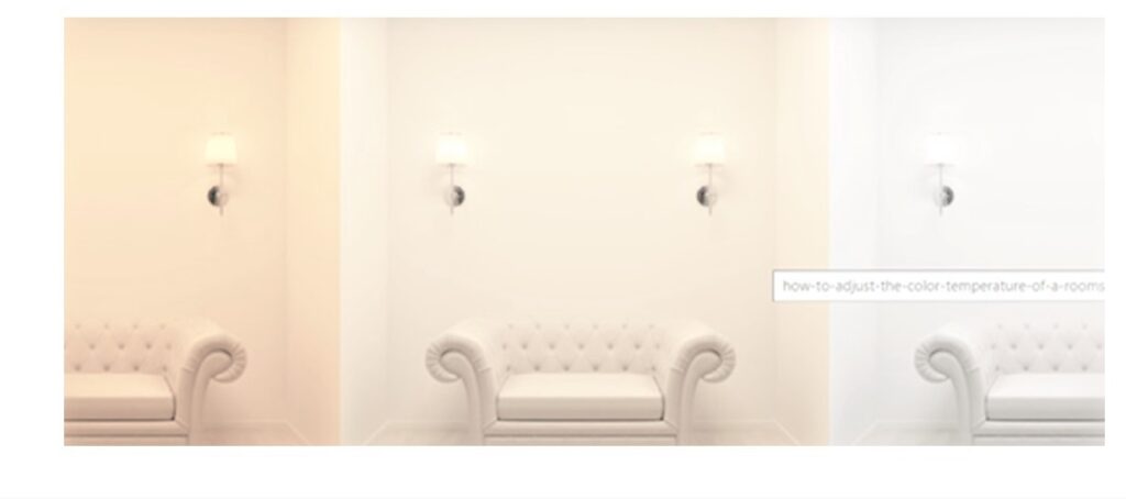
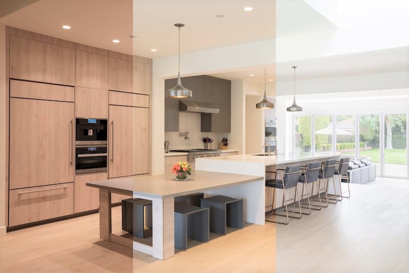
The kitchen above shows the vast difference the color temperature of the lighting will make in a space.
From the paint color to the flooring, cabinetry, and countertops.
(And notice how the mood feels very different as you look from one colored space to the next.)
Look for color temperatures between 3000K– 5000K. The lower the number, the warmer the color is.
But otherwise, a soft white light color lets room colors be their true selves. Whites look soft white, not yellow; blues look blue, not green-blue, purple look purple, not a brown-purple raisin, and so on. Much better.
So I’d always recommend checking your lighting color first, changing out whatever is needed, then selecting and testing your paint colors.
BONUS TIP:
If choosing the perfect paint color is part of redecorating or remodeling a complete space, choose your paint color LAST
Why?
Because there are endless paint colors options compared to the number of options you will have to choose from for everything else from upholstery to countertops.
But the right paint color will always be out there that will coordinate beautifully with your more limited fabric or finishes choices
If you need to go from guessing to knowing what colors are right
25+ years of experience in creating inviting designer spaces.
Simply start by telling us about your project
Call 425-977-5599 or
Avid DIY-er needing feedback, options & answers?
A Video Call or In-Home Design Consultation
may be all you need:
Simply call us at 425-977-5599 or