Having Specialized Color Training Revolutionized My Color Consultations
Any interior designer worth their fee has an “eye for color.” But as a “Certified True Color Expert,” to be able to know what TYPES of colors work, that’s golden. Why?
Because there’s no need to look at EVERY neutral or color to find the right ones
The system is based on knowing how to correctly identify undertones so complementary combinations can be created and conflicting ones avoided.
It’s the most accurate system of selecting colors I have ever used
Let’s see how this can work when selecting colors for the newest trend- black and white kitchens and bathrooms.
I’ve selected two countertops, each with a different undertone. And paired them with a paint and cabinet finish in both a complementary and then a conflicting undertone for comparison.
Look at the difference the right vs. wrong undertones combinations make. It’ will make the difference between a hit or a miss in a kitchen or a bathroom.
(It may seem subtle in the samples but the completed rooms that follow show how pairing the right undertones plays a major role in pulling a room together.)
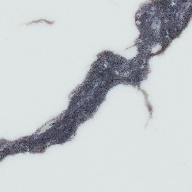
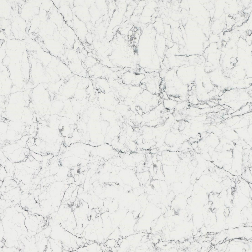
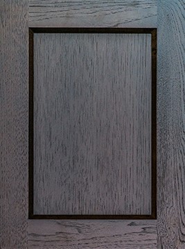
Pental Quartz Arezzo
BM-1618 First Snowfall
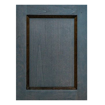
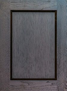
Vanway Ebony
Complementary Undertones
All of the above finishes have the same true gray undertone. They relate well, make each other look their beautiful best, and feel coordinated. It just looks right. The makings of a well-designed black and white kitchen or bath!
Pental Quartz Arezzo
BM-1618 First Snowfall
Vanway Ebony
Conflicting Undertones
I’ve swapped out the paint color with one with an ivory (yellow undertone). Instead of everything pulling together the paint jumps out as a misfit. It’s distracting instead of creating a flattering backdrop for the real stars, the beautiful countertop, and cabinets.
Caesarstone White Attica
BM OC-117 Simply White
Vanway Charcoal
Complementary Undertones
This same ivory though works beautifully when it’s paired with an ivory-white countertop and a complementary charcoal-brown cabinet.
Pental Attica Quartz
BM-1618 First Snowfall
Vanway Charcoal
Conflicting Undertone
Here’s the original gray-white paint, that looked so perfect with the first gray-white countertop and charcoal cabinet. But so cold and out of place here with the ivory countertop and charcoal-brown cabinet.
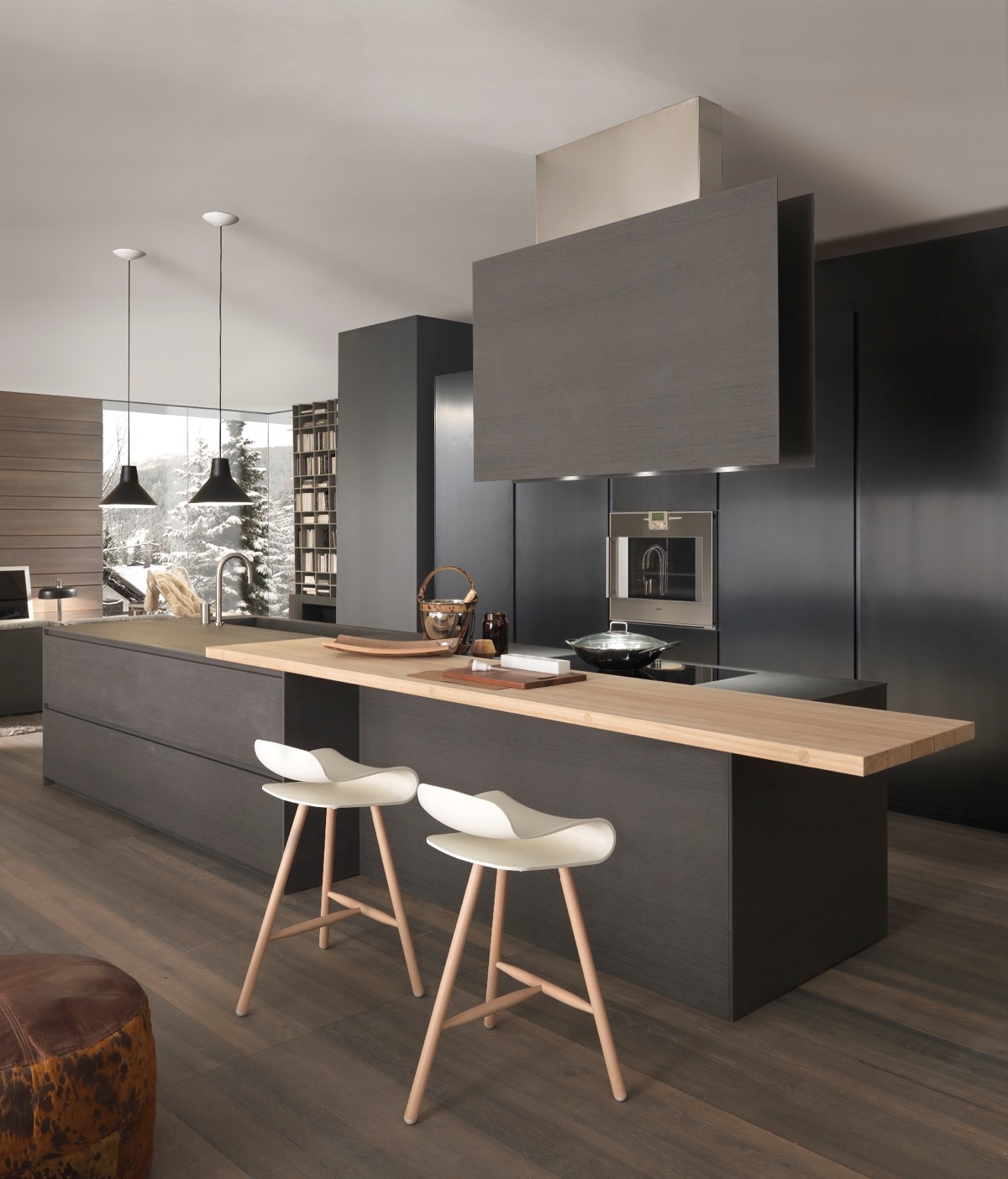
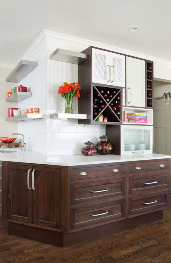
Black & white kitchen with coordinated undertones
This kitchen’s undertones play off each other so well your eye can easily flow around the space. No jarring distraction just intentional accents to catch your attention.
Source
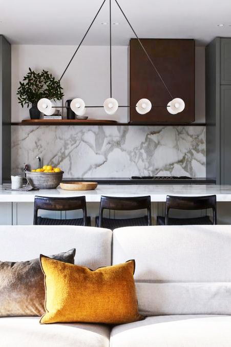
Black & white kitchen with conflicting undertones
All the component styles are well selected and laid out. But a gray-white rather than an ivory for the upper cabinets and island tile would have been the most complimentary with the countertop and pure charcoal-gray lower cabinets.
Source
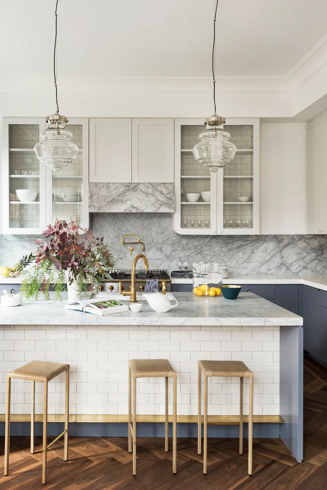
Charcoal-brown & ivory kitchen with coordinated undertones
The yellow undertoned ivory is a perfect complement here with the charcoal-brown.
This is also a gorgeous way to do a warmer version of the black and white look.
Source
Charcoal-brown & pure white kitchen with conflicting undertones
The pure, bright white with the charcoal-brown cabinets creates a starker contrast that feels disconnected.
Whereas ivory would effortlessly feel right at home here.
Source
When I’m helping people who have already started collecting samples but are unsure about the colors, the most common problem is conflicting undertones.
If you are struggling with feeling sure you’re getting them right, I can help so you can select your colors confidently
Just Call 425-977-5599 or Connect Online
Let’s discuss your project. Your first step to choosing colors confidently!