So, What’s the Secret to Picking Those Perfect Paint Colors Anyway?
Source:
Not what you might think.
Most people are surprised at what all is considered when we help them choose the right colors for their home. Hint: It’s not as simple as picking out favorite colors and voila!
So to make it easier for you to get to those right colors, I’ve put together 7 major ways to choose the perfect paint colors for your home. (Because loving everything else about your space, can’t overcome the wrong wall color.)
SOURCE
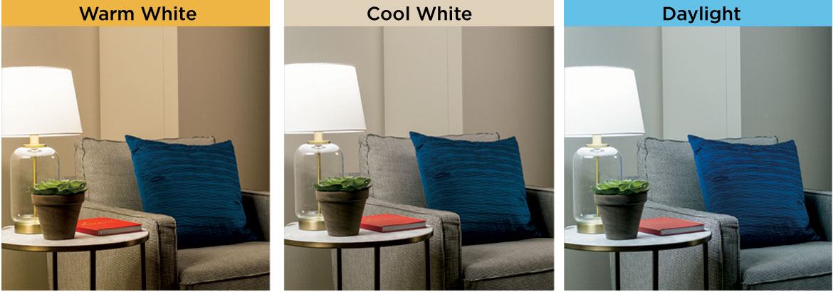
1. Check the Lighting
Before you check paint colors, check your lighting It’s the only way you can see the real, true color
If your lighting is yellow or green or various colors it will need to be replaced so here are guidelines based on your design preferences:
WHITES Are especially susceptible to the color of the lighting.
MODERN STYLES To keep whites looking pure white a cool or daylight white light will do that. (Otherwise, they are too cold looking for most people.)
ALL STYLES A warm white (not yellow, but off-white like incandescent bulbs were) is an inviting light in any room.
TIP:If you have significantly different light levels… Like a darker family room than the kitchen in an open floor plan, even them out with complementary neutrals like a lighter neutral in the family room.
TIP: If You Have Lots of Large Outdoor Foliage… It will reflect a green glow onto walls opposite any large windows. You can’t prevent this but you can either adjust the color or be prepared for it to have a slightly different cast to the room during the day.
SOURCE
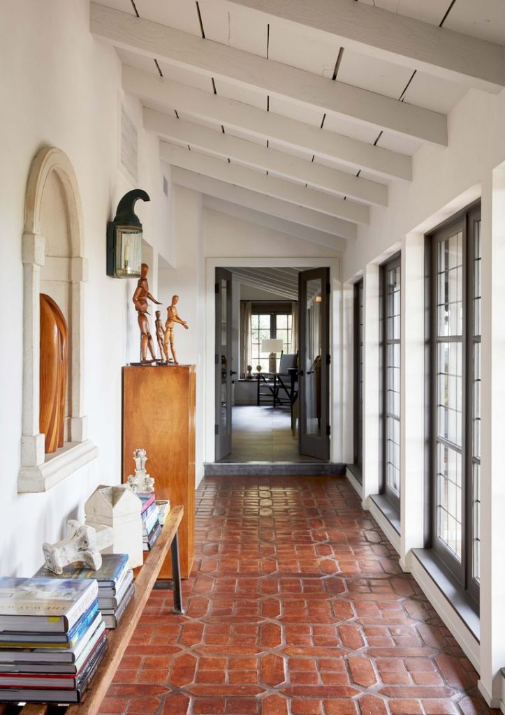
2. What is Staying?
What stays will decide your paint color options
Because the paint will need to complement the color of any “fixed elements” you’re keeping in the room.
That will include the flooring, window frames, trim, doors fireplaces, exposed brickwork, and any other permanent fixtures, (even in the kitchen in open floor plans).
In the above entry, the terra cotta flooring is complemented by the softer off-white wall color, whereas a pure white would have looked too stark.
SOURCE
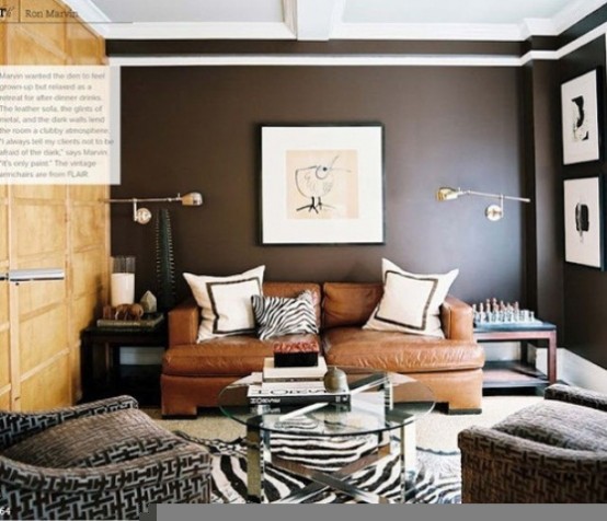
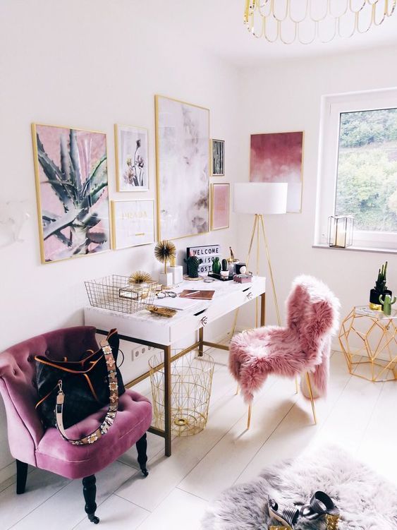
3. Know Your Undertones
Most fixed elements are a neutral which all have undertones. If any are staying, you’ll need to know what they are.
WHAT ARE UNDERTONES? They are the subtle, secondary colors that can be seen in a color. And pale neutral undertones are the trickiest to see (if you don’t know how to check for them).
WHY DO THEY MATTER? Undertones will either complement or clash with other undertones and colors. So, getting them right really matters.
HOW CAN YOU SEE THEM? Compare them to other neutrals and you will be able to see the different undertones easier.
AVOIDTHESE COMBINATIONS Pink or purple undertones (in taupe’s, some grays) with yellow, orange or gold undertones or colors.
THE ABOVE ROOM PERFECTLY BLENDS the bronze charcoal wall color (with its brown undertone) with the existing golden paneled wall. A dark taupe for instance with it’s pink/purple undertone would have looked off with the yellow undertone of the wood,
SOURCE
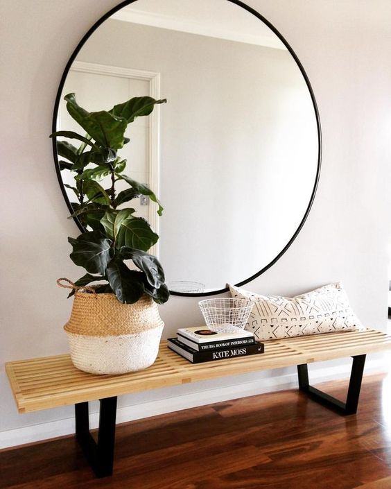
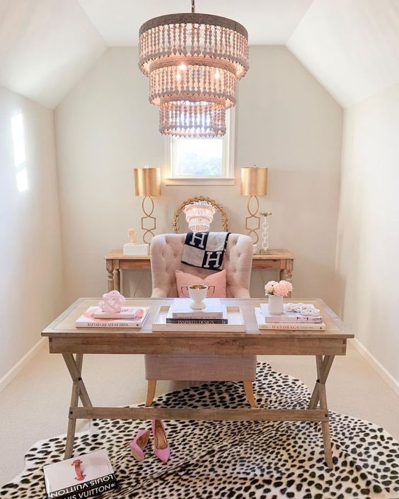
4. Complement Your Decorating
Your wall color is the backdrop to everything else in your room. And it helps to set the mood.
When it’s right it beautifully supports what’s important in the room by accentuating everything that you have. And creating a setting that pulls it all together.
The room above has used a white with a bare hint of a pink undertone so effectively to add the extra glam mood to the room. A pure white for instance would have created a fresher, crisp mood where this is as feminine as it gets.
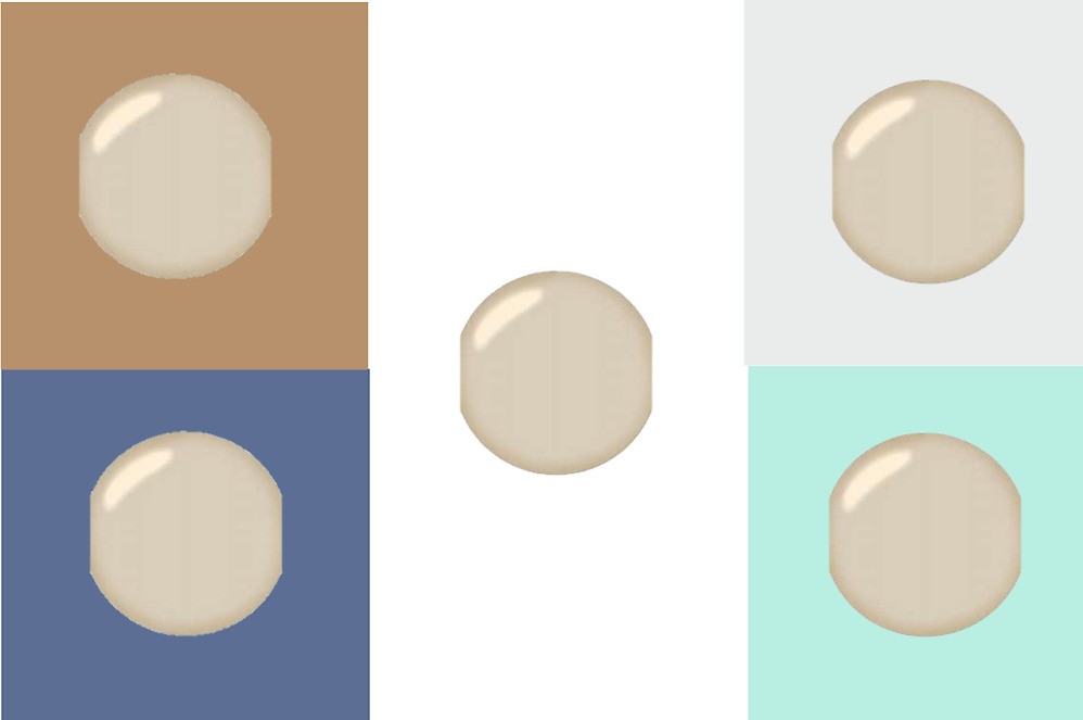
5. Testing to See the True Color
I really can’t stress this enough but because color is such a chameleon…
never (did I say “never”?) OK never test it on your existing wall color.
Because the color comparison will throw off your perception of the new color. Meaning it will look different once the old wall color is gone.
TO SEE TRUE COLOR, you need to see it isolated next to a true white.
In the example above the test color next to other colors looks
Drab by the rich caramel
Paler by the dark navy color than it will look later on its own
Yellowish by the gray
Muddy by the teal
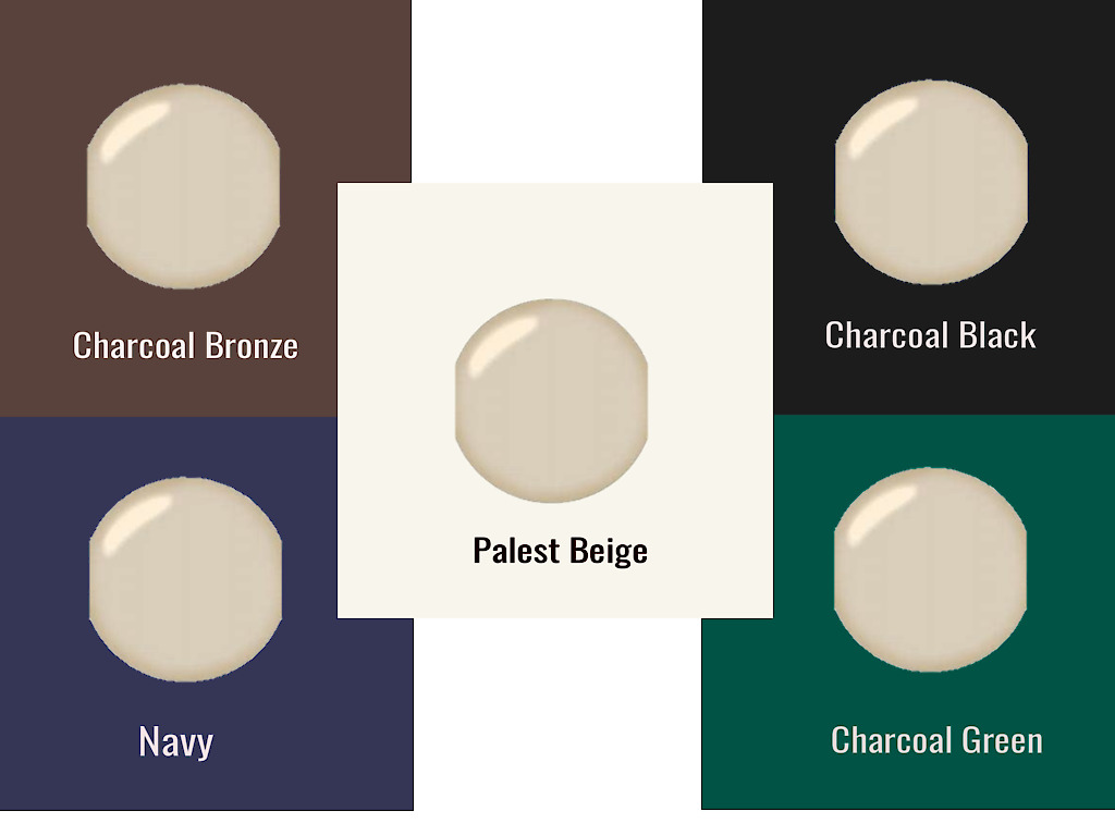
BUT WHEN WE SEE IT’S TRUE COLOR NEXT TO WHITE it’s a beautiful khaki that could set the stage for several decorating palettes! Like black and white, or deep charcoal green or a bronzy charcoal brown or a palest beige palette. (Even a navy with more blue and less gray works.)
CREATING YOUR TEST SHEETS:
Paint a removable plastic film like “Sureswatch” and border with white paper on the wall.
Or order a painted sample from “Samplize”, border with white paper
Or paint a sample on white mat board leaving a wide border
You’ll have a portable sample you can try anywhere and with anything, even your furniture, flooring, fabrics, etc.
Test daytime (between 10-3) and nighttime
Test in the higher and lower light areas
SOURCE
SOURCE
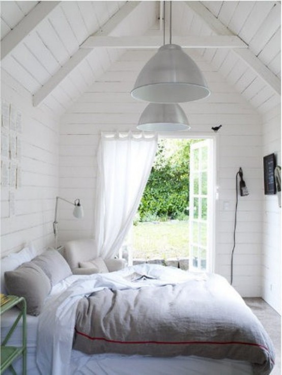
6. The Right White in Rooms with Little Natural Light
Without a lot of natural light pure white will look pale gray so it actually won’t brighten up a lower light room.
In those cases, it’s better to choose a warm white (palest beige) to give it a cheery, sunny glow like the room on the right.
SOURCE
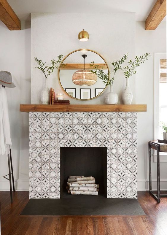
6. Pick Your Paint Last
There will be many more paint options than options for anything else
In the room above the tile, flooring, and mantel were carefully and beautifully curated first. And there were a number of options to choose from of complementary paint color with a coordinating undertone.
Doing that in reverse would have meant A LOT more looking for tile, flooring, and mantel options that
Coordinated with the paint
Coordinated with each other
That you liked
Choosing Colors With Confidence Made Even Easier
As a certified "TRUE COLOR EXPERT" I'm happy to help by creating a beautiful color palette for you & your space
Just call 425-977-5599 or