Making a New House Feel Like Home
The Art of Making Another “Home Sweet Home”
My client’s parents were moving in from out of state and had found the perfect place for putting down new roots.
They found a home in one of the park-like jewels just north of Seattle at Millcreek. And since they were formerly from the floral industry surrounding themselves with lush garden views was just a natural move for them.
The next order of business was to update the home and their decorating. So let’s take a look at…
Vignette views of a new home’s transformation & how they were created
- SETTING THE STAGE
Since the walls and the floor are the backdrop for everything else in a room we looked at that early on. Keeping them simple, light and neutral left lots of options open for decorating.And they would complement rather than compete with all the beautiful garden views.
- MAKING WHAT CAME FROM THE OLD HOUSE LOOK FRESH IN THE NEW HOME
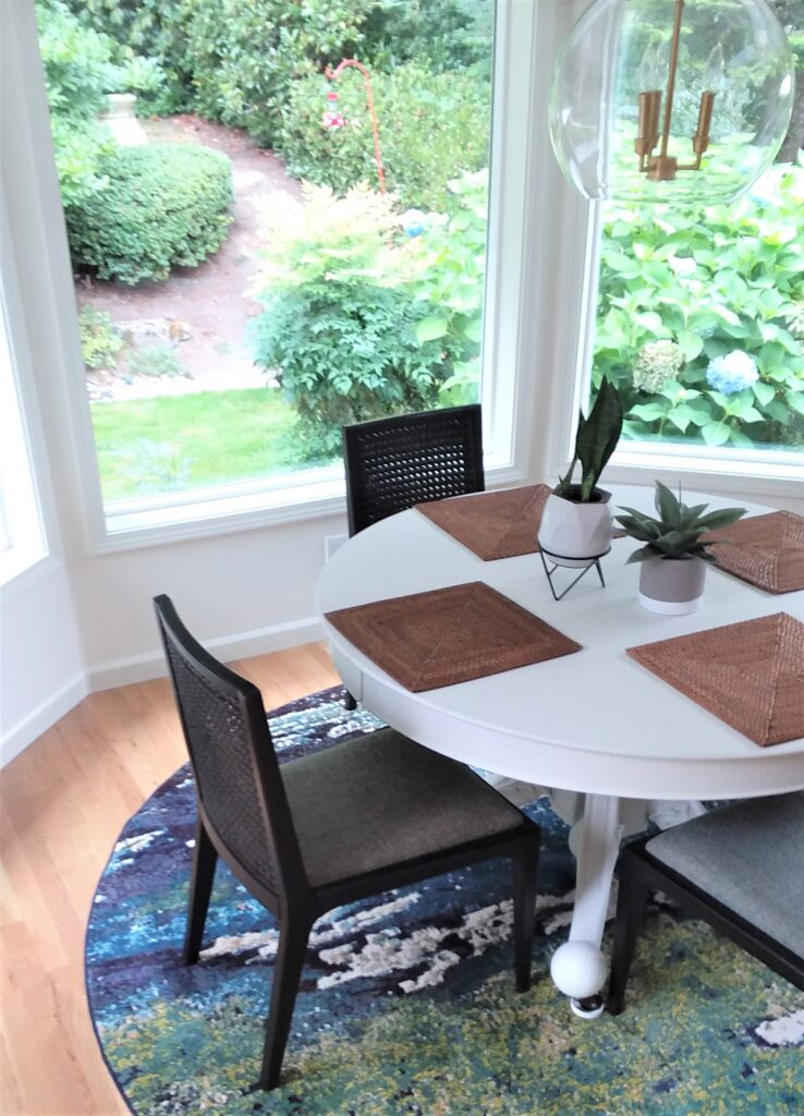
Starting with the nook shown above they’d brought a few favorite pieces along with them that they wanted to be incorporated into their new home.But because they were bought to work with another house that can be challenging to make them look at home in the new house.
This antique dining table is just such a piece and had so many memories made around it as this couple was raising their family. And after a while, a piece like that seems like part of the family and it just wouldn’t feel like home without it.
So the designer’s job is to now work with it in such a way it fits in seamlessly and beautifully. The solution was to change the color from sage green to soft white.
And that made all the difference by
- Giving it a fresh updated look
- Connecting the inteior decorating to the wall color
- Coordinating the nook with the adjoining white kitchen
- Beautifully setting off the dark wood dining chairs (that also came along)
- NOW FOR A TOUCH OF COLOR
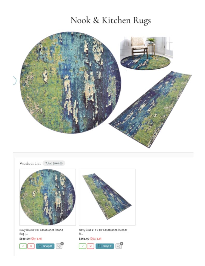
The nook now needed a punch of color. So we choose an area rug in some of the client’s favorite colors that also would bring the out of doors indoors and blur the line between the inside and outside.Creating even more to the feeling of dining alfresco in the garden.
And adding a matching runner to the kitchen coordinated the adjoining spaces while adding another color accent.
This virtual design board with its linked shopping list made it easy for them to visualize the rugs and click to shop:
- THOSE ALL-IMPORTANT DETAILS
LIGHT FIXTURE
Because of the outdoor views, we didn’t want a chandelier to block it, so a large clear glass globe fixture was the perfect solution.- It’s still the right scale for this large table but it almost disappears from view
when you look through the nook to the outside from the adjoining great room. - The round shape complements both the table and the room’s shape.
Making everything look like they were meant to be together.
- It’s still the right scale for this large table but it almost disappears from view
TABLESCAPE
Keeping it simple once again, adding woven placemats reflecting the kitchen counter color and bringing in a natural organic texture along with a pair of potted plants.
Just enough to make the space feel cozy, complete, and ready to enjoy.
“Do first things first: Walls and Floors
Make the old fresh to fit the new
Set your Color Palette
Do the details!”
The Fireplace Gets Renovated
The Big Dictator in the Room
The fireplace style will always dictate a spaces decorating options
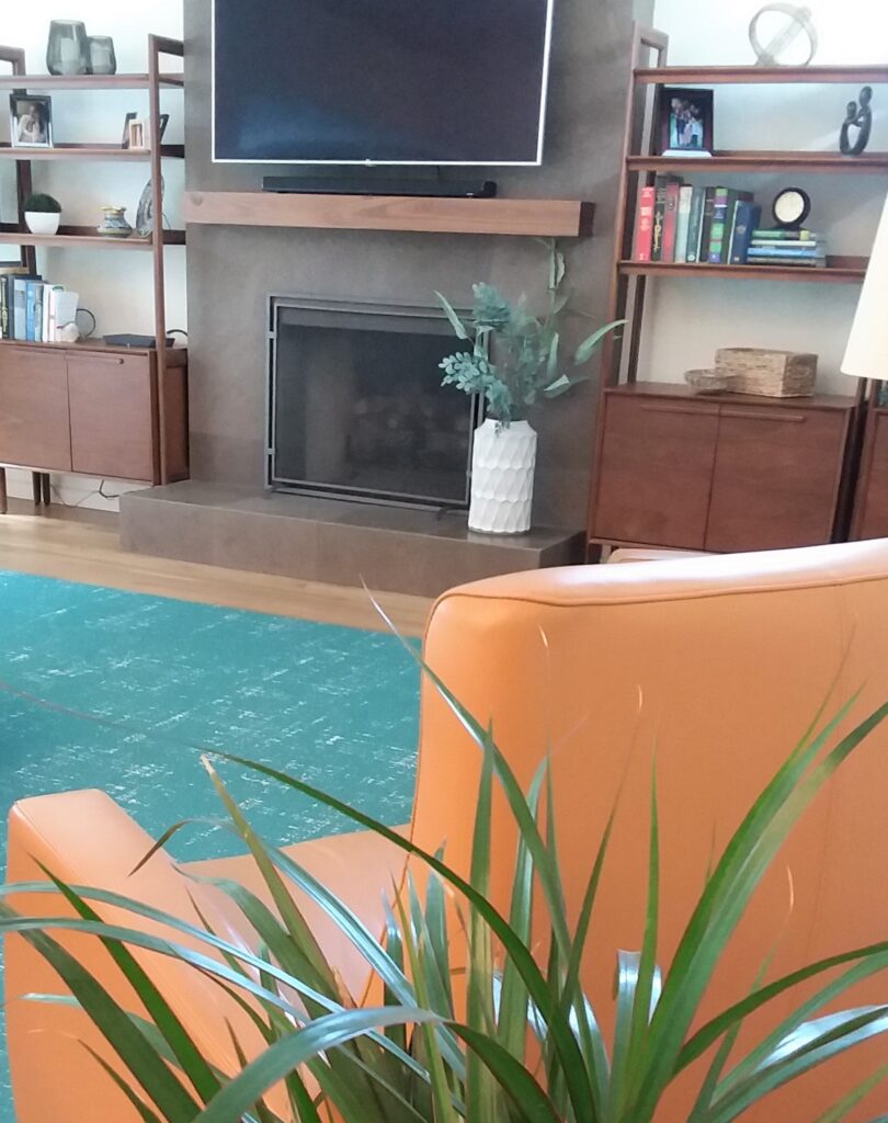
This home has great classic architecture but since it was built during the Tuscan trend it gave a nod to that era with a Mediterranean style arch built into the great rooms brick fireplace.
It was unique in its day and not in step with the style of the rest of the home and now it was going to conflict with the mid-century modern decorating style planned.
So something had to be done and various modifications were considered but in the end, it was too important to the room and it was given a whole new look.
It was refaced in a simple but architectural style in a beautiful brown stone that reflects the kitchen countertops.
And in the process tied everything together from one end of the great room to the other with a shared style and color.
The custom wood mantel was added in a wood tone that coordinated with the new bookcases planned, creating more of a customized built-in look.
Coordinate the look of a great room fireplace with the kitchen
The fireplace will dictate your rooms decorating options
Look for design opportunities to create a custom look
(i.e. mantel complemented by bookcases)
It's All in The Details
Accents Give a Room It’s Unique Personality
And add lots of warmth to a white kitchen
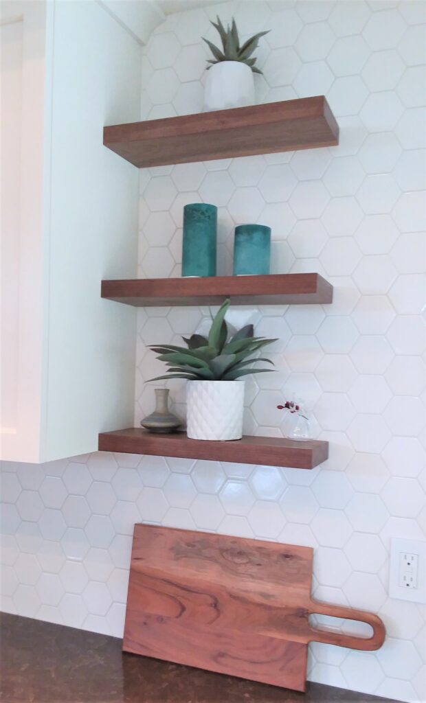
Here, the teal candles, reflect the great room’s area rug, and the cognac-colored cutting board and walnut shelves reflect the great room’s leather chairs and the walnut mantel.
And the organic wood textures and plants all connect back to the kitchen’s garden views.
The details require as much thought as the major components because together they make a statement. Like how this vignette does, adding so much more than an additional white cabinet door would have done.
Fresh white spaces make accents beautiful and visa-versa.
Accents bring in any adjoining rooms colors & style
Accents will add up to make a statement
The Art of Saving & Updating
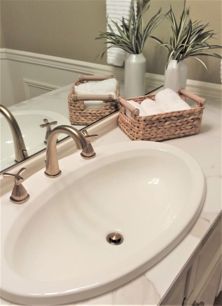
Looking Past What’s Not Working to Take Advantage of What Is
The powder room was spacious, and what I called the “birdbath-sized” sink was nothing short of spectacular.
But in spite of all that the room as a whole didn’t draw you in. It felt dated and lackluster, giving you a “get in and get out feeling, nothing beautiful to enjoy here”.
This can easily happen in a new home and people either live with it as is, thinking it’s all gotta go and that’s an investment they hadn’t planned on.
Or the room is completely gutted unnecessarily and even some things they may have liked to have kept go away because they didn’t see a way to keep them by taking advantage of them.
This powder room’s transformation solution was the perfect balance between keeping the best and modifying the rest to complement it.
Here’s how it happened:
- Countertop Update
A beautiful large-scale faux marble tile was selected to keep grout lines to a minimum suggesting more of a slab stone look. - Faucet Update
A combination classic/modern style faucet set was selected in the same brushed brass finish as the adjoining great room was done in - Vanity Hardware Update
An easy update that still adds up to make a difference. - Vanity Light Update
A longer and updated fixture was selected to better balance out the oversized but single sink vanity. - Vanity Mirror Update
The original mirror only went partway up the wall. So replacing it with a mirror flush to the ceiling made it disappear. A cleaner, updated look.
And then the light fixture could be mounted directly on the mirror adding a customized, upscale touch. - Wall Color Update
An accent color was selected to give a coordinated but unique look to the space.
Save the best if it works with your look
Select everything else around it to complement it
And create your own unique space!
Casual Decorating Relaxes a Formal Dining Room
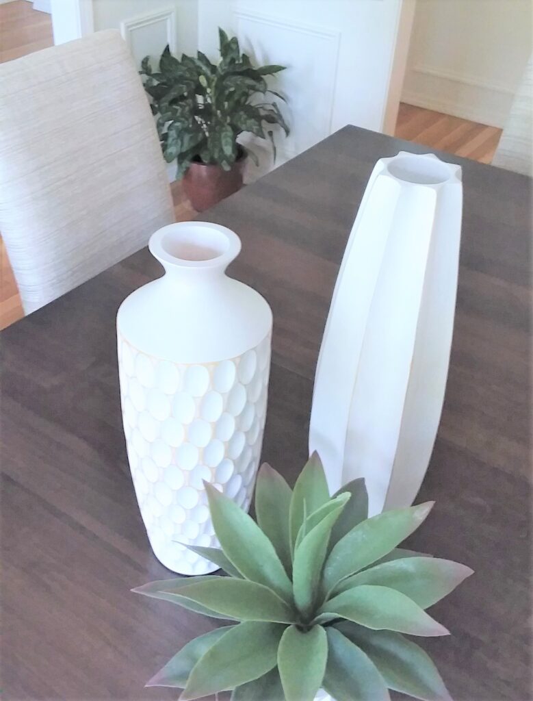
Casual Can be Strikingly Stylish If You Simply Go Beautifully Bold
Because I’m based on the West Coast many of my projects are here where life is very casual. (Everything from semi-formal to semi-hiking attire was OK at the symphony.)
So when a client has a floor plan with a formal entry, living, and dining room, we need to find ways to make them beautiful but in a more relaxed way.
That was what we did here in the dining room by selecting a table with classic but simple lines and pairing it with iconic Parsons chairs.
But notice how the tablescape, although we kept it simple, is bold in design, color, and size to still make a big statement
- The design of the wooden vases are simple but strikingly arty
- The white is in high contrast with the dark table for drama
- The uncluttered look and unfussy materials used keep it casual
- The oversized vases are a bold touch
Going bigger & bolder with accents for a casual look that will make a statement
Make a Casual Grand Entrance
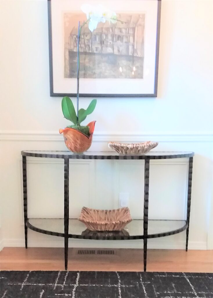
Mix Grand Style with Casual Accents
An entry per square foot is the most important space in your home.
Because it is the first page in your homes’ story everyone will read to get them acclimated to life at your house.
Here we needed to keep the beautifully casual theme going. And this family piece of collectible art framed gallery style paired beautifully with an airy demilune metal table the clients found. And its handcrafted look adds so much to its simple appeal.
A black rug was selected to coordinate with the living room’s beautiful classic black marble fireplace that could be seen straight ahead as you entered. But the rugs’ casual pattern purposely toned down the fireplaces’ formality.
The accessories are a combination of refined and casual with the live orchid in a handmade glass container that pulls in the color of a family antique in the adjoining dining room. And a pair of very organic-looking handwoven tray bowls keep it from being too perfect.
Casual combined with refined will keep formality beautifully at bay
Looking for ways to make your "Home Sweet Home"?
25+ years of creating comfy, inviting designer rooms;
simply start by telling us about your project
Call 425-977-5599 or
NEW
2 Quick ways to get design help!
One Time 2 Hour In-Home Consultation
with Interior Designer Mary Brown
Get design direction and answers to pressing questions about your home!
30 Minute Virtual Q & A
Interior Design Consultation
Design consultation via email to answer up to 4 specific questions about your home!
