Who Wouldn’t Love This Holiday Gift For Their Home-
“Design Advice!”
(Answers to questions & some direction to implement at their pace)
I love getting these “before” room photos, and any “inspiration” photos, along with questions to provide some answers and to help give guidance so people can do it on their own timeline.
So I’ve made getting design advice quicker and easier than I ever have with my Design Advice Video Call!
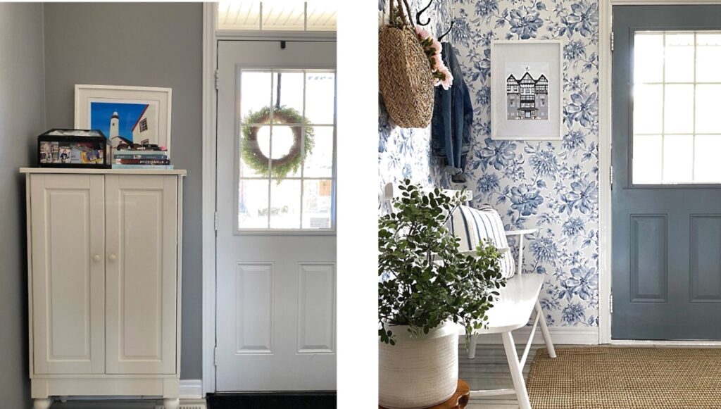
It’s meant to tackle a problem in a room like “What do I do with my big, blank wall?”. Or in a small space like “How do I create the look of an entry when we don’t have one, you just step into the living room?”
If there is a whole room that needs creating these two options are perfect for those needs
- Designer by Your Side
-Hourly design assistance as you do it yourself - Full Room Design
-Flat fee room design with furnishings/decor selection & room arrangement
30 Minute Design Advice
(with recorded virtual call & written transcript)
It’s simple to get personalized design advice, plus have a video and written record to refer to later:
- Email the Room & any Inspiration Pictures, and the questions.
- We’ll schedule the Video Call.
To view the pictures together to answer questions & give some added direction. - Receive the Video Recording & Written Transcript
For reference later.
Here are a couple of examples of spaces with answered questions and some directions to help with implementing the ideas.
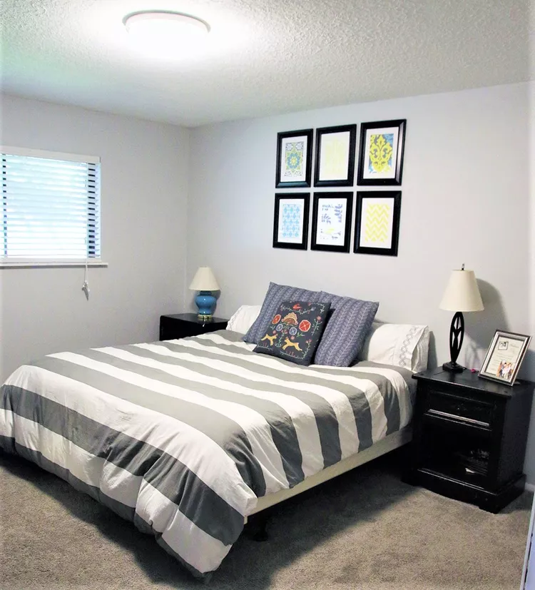
The Boring Bedroom

Where do we start to update this tired bedroom?
There are all kinds of opportunities to transform this room and here are my suggestions for areas to focus on:
Start with your colors
Overall I’d say to add some warm tones, some greens, and a creamy white with dark chocolate, and black as an accent. And move away from the grays unless they are charcoal.
Add furnishings in a warm but light wood tone like the bed or bedside tables. They can match if you like but a warm wood headboard and black bedside table would be my first choice!
Think flooring (& area rug)
Replacing the flooring will work wonders to upgrade and lighten the room. A paler, warm tone in wood or a faux wood product, (Luxury Vinyl Plank), is beautiful now and being used a lot.
Add an area rug that incorporated your new color palette. It doesn’t have to include all the colors but just relate to it. It can be a solid texture or a pattern. The bigger the better in a bedroom for “barefoot warmth and softness; unless you prefer lots of your flooring to show.
Dress up the walls
Add wallcovering on the wall behind the bed with some creamy white accents that you can then coordinate the new wall paint with.
Leave the ceiling and trim the existing white to go with the rest of your home.
Next, make the bed the star
The bed is the focal point so choose it first and let its style and color lead the way for the other pieces and decor to complement it.
Other than if you are changing the flooring to a wood look; select that first and the bed second. Because there will be fewer flooring options (than beds) because it has to also go with the adjoining flooring in the hallway or a bathroom.
Add a modern headboard in a warm wood tone that is tall enough to really show above the pillows.
Replace the duvet cover with one in a solid dark chocolate color or one of your palettes neutral. Place it on the bed so it falls equally over all three sides.
Stack two sleeping pillows flat on each side of the bed. Turn the opened end of the pillowcase to the inside of the bed for a finished look. Place one accent pillow in front of each stack or one long bolster pillow over both stacks.
Dress up the windows
You can leave the window binds if you like but add floor-to-ceiling side panels of fabric in the new wall color. (My first choice.) Or add a light woven wood valance on the top. Either will add softness and make the window and room feel more finished.
Add style and mood with the right lighting
There is a wonderful opportunity to have a “statement” hanging light fixture in this room. It’s the style and size that will make the statement as they come in many price points. And put it on a dimmer so you have light-level choices.
The finish can be in matt black, oil-rubbed bronze, or satin brass. They all will complement your new color palette.
Just keep in mind any existing finishes may need to be updated (or ones that are to be chosen like the table lamps) will need to coordinate.
In a bedroom, existing finishes would also include any ensuite/adjoining bathroom plumbing hardware and lighting fixtures.
It’s OK to mix the matte black or oil-rubbed bronze finishes with the satin brass since those combinations are all great together.
The table lamp style should complement the ceiling light but not compete so something simpler in style.
The shade should be no bigger than the bedside tables and a little smaller is better. The height should be just low enough so as to not catch the bare bulb in your side vision while sitting up in bed.
DESIGNER TIP: Check all samples in your room’s lighting
From paint to flooring to fabric to wall covering; both during the day (a sunny day and a cloudy day if you have lots of those). And then check again at night too so you see what the real colors are in your room vs. in the store.
The ideas will lay the foundation for creating an updated, finished-feeling bedroom that is beautifully calm but definitely no longer boring!
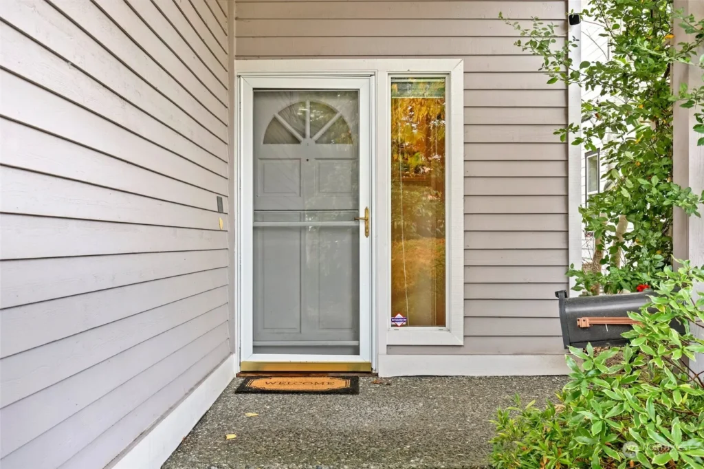
The Ho-hum Entry

“How do we dress up this entry, it feels so bare and blah!”
This has all kinds of potential here to overcome it’s underdone look at the moment so I’d suggest:
Start with the front door color
I’d suggest painting the front door in charcoal or black. It will accent and update the gray house color and help diffuse the screen door color over the front door. (And the mailbox will now coordinate with it too.)
Keep the door trim white, and add satin brass door hardware to the door. It will coordinate with the screendoors brass hardware and kickplate though not as shiny so less formal. Which I feel fits your home’s style the best. And will look striking on a charcoal or black door.
Next up, replace the doormat
This is a nice-sized covered entry so a great opportunity to use an outdoor area rug to replace the small doormat and make it feel as big as it is.
I’d suggest something with a small pattern so it is better at hiding outdoor debris. And have some black in it but no gray as we want to update the gray house color with more current trending colors and neutrals.
One thing that is important to keep in mind too is you will not only want to coordinate the area rug with the exterior you’ll also want it to coordinate with the interior entry flooring and area rug. Because when the front door is opened they will all be seen together.
Time to add a potted plant
Add a tall, narrow, square-sided container about 24″-36″ high. And place it centered on the wall space to the right of the window.
The pot can be matte black metal, pottery, or resin. Or in a color to coordinate with the area rug.
Place a year-round tall, narrow, evergreen plant in it to finish the look.
Keep the walkway plants trimmed so that the walkway seems as wide as possible for that big entrance feeling.
Let your light shine
Have a hanging, decorative matte black light fixture overhead that is an eye-catcher as it will be an important part of your home’s front exterior style from the street and up close as people enter.
Lastly, add simple, modern decorative house numbers
in matte black. Place them to the right of the door, centered on the wall space over the plants, about 4 boards down from the window trim.
All together these changes and additions will make your front exterior and entrance in particular beautifully welcoming!
Give a gift they will love:
DESIGN ADVICE FOR THEIR HOME!
30 minutes that will change a space /$98
TO REQUEST TO PURCHASE A GIFT CERTIFICATE
Call 425-977-5599 or


