Creating Calm, Light-Filled Spaces to Call Home
for a couple in their first house
It’s an exciting and long-awaited time to be decorating your first home!
But it can feel a tad anxious too trying to manage inspiration dreams, functionality needs, and your investment to create your own “home sweet dream home”. All the while thinking…
How do I get the look I want?
Going from inspiration photos I love to rooms I love?
How do I decide on updates?
What can stay and be refreshed and what just needs to go?
How do I know what colors and styles will go best with what’s staying?
How do I not make time-wasting and expensive mistakes?
As I tackle something as important as my home and my investment in it?
Lots of my clients are new to having a designer on their team and these are common questions that come up.
Let’s see how we solved them while helping these wonderful clients design their first home!
Getting The Look You Love
Starts with us asking lots of (the right) questions
In doing that with this couple, I found a major way their styles overlapped: Plants!
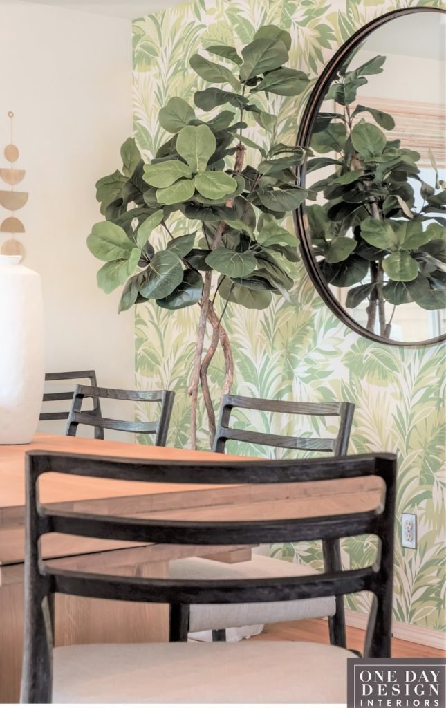
So I gave them this tropical foliage motif wallcovering to turn their dining space into a garden room. Making it a special place for daily dining and entertaining.
But how I got there was first finding out what each of my client’s idea was of a dream space for their combined entry, living, and dining spaces.
So I started by gathering the information that would tell me the parameters I needed to design within. To make sure the spaces would fit both of their styles, (which were more different than alike; a common challenge but there are ways to solve it!). And that the design would fit all their lifestyle needs, and last but not least their planned investment.
Here’s what I discovered between meeting with them in their home and the project questionnaire they each filled out. It’s what would put me in their “design ballpark” while designing their dream rooms:
Design
-Agreed Upon Mood: Calm, light-filled with the organic feeling of nature.
-Her Style: Neutrals, classics, Japandi
-His Style: Color, global, lots of coordinated wood finishes
-His & Her Inspiration Images: Gave me a clear picture of each of their ideas of dream spaces.
Functionality
-Easy entertaining for groups since they loved to cook, be a barista and mixologist, have game nights, and play music.
-Comfort since these are spaces they’ll use every day
-Compatible with 2 small dogs (who knew they were family too!)
-Daytime privacy but still, let in lots of light and the view of the yard.
Investment
They wanted pieces that would last and that they could enjoy for a long time. And just change up the details for a fresh look.
Another view of the dining room’s Japandi, organic vibe
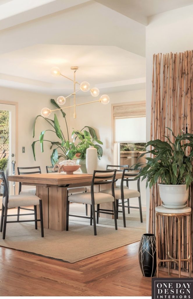
Calm, light, and airy look with lots of natural textures,
for dining anytime
Deciding on The Updates
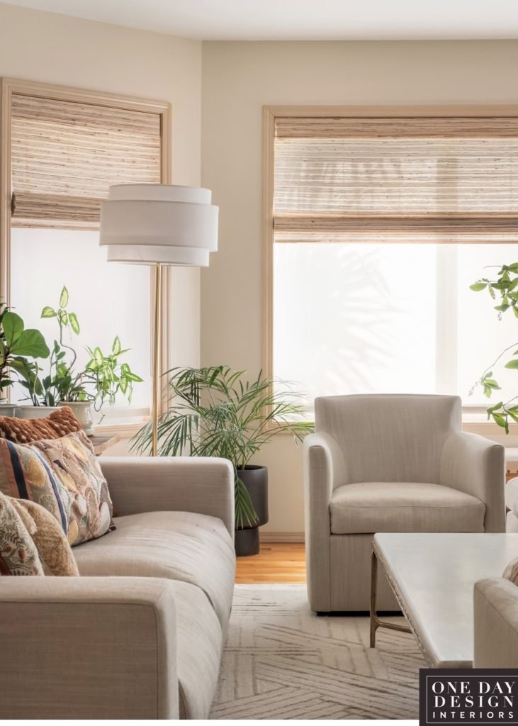
What should stay, what should go, what should be refreshed?
The choices that were made here maximized their investment without compromising the design
Once I knew the overall look I was to create we discussed what updates needed to be done, what just needed to be refreshed, and what could stay and successfully be incorporated into their style changes.
So we looked at the basic elements of the space to decide:
FLOORING: Wood flooring in solid oak and narrow boards
Almost everything about it worked, the condition and the color were all good. The narrow boards are classic so it is more timeless. The only compromise was the finish was shiny by today’s standards. But I didn’t feel it was a deal breaker in the design that it needed to be invested in now. So that was a major saving.
WALLS: Creamy Ivory
It was a tad pale yellow looking when we started but I suggested waiting until all the new furnishings and area rugs arrived to see if it still needed to be changed to an off-white.
Because they wanted a warm feeling to the room none of the furnishings were specified in pure white. (Which in contrast would have made the walls look more yellow.) So in the end with the furniture and area rugs in the spaces, the wall color worked beautifully “as is”. So that was another big savings.
LIGHTING: A mix of styles, and needed more light
Light fixtures are so visible in a space I feel those always need to be right. So suggested updating two entry hallway ceiling fixtures. We added two modern, satin brass flush-mounted fixtures. They did so much by adding a modern sculptural element to the open entryway which could be enjoyed from anywhere in the combined space.
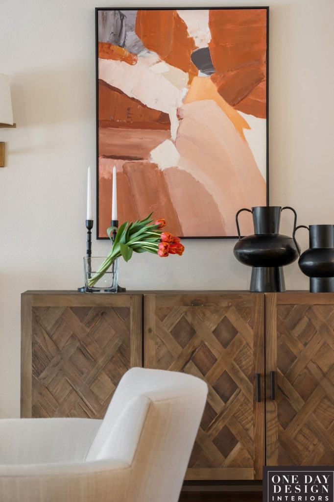
We also added a pair of sconces to flank the fireplace to add light at that end of the room. That eliminated any issues of lamp cords over two walkways into the floating furniture arrangement. Ad it added a style update to their fireplace area.
The Mid-Century Modern dining room chandelier was negotiable and the clients liked it we stayed with it And that was another saving so they could invest in something more important to them in the rooms.
FIREPLACE: Was looking undersized for the space and dated
The combined entry, living, and dining room created a very nice large space. And the fireplace done to scale would be the star, and seen from every angle. Since that is a bigger project it can be a stand-alone and done at a later phase.
WINDOW COVERING: Needed a style change and more functionality
Because the existing heavy slatted blinds weren’t meant to draw up it made for a constricted outdoor view. And when down affected the light level options and hence the mood of the room. So updating them was a definite “must have”!
A two layers solution was selected:
-A sheer roller blind to let in a slightly diffused light but still allow a yard view.
-And another layer of woven wood in a flat Roman shade to give more coverage at night.
-As well as add a natural decorative texture to the windows.
-And create a valance during the day when pulled up that covered the roller shade hardware.
Maximizing the entry
-where function & design had to meet
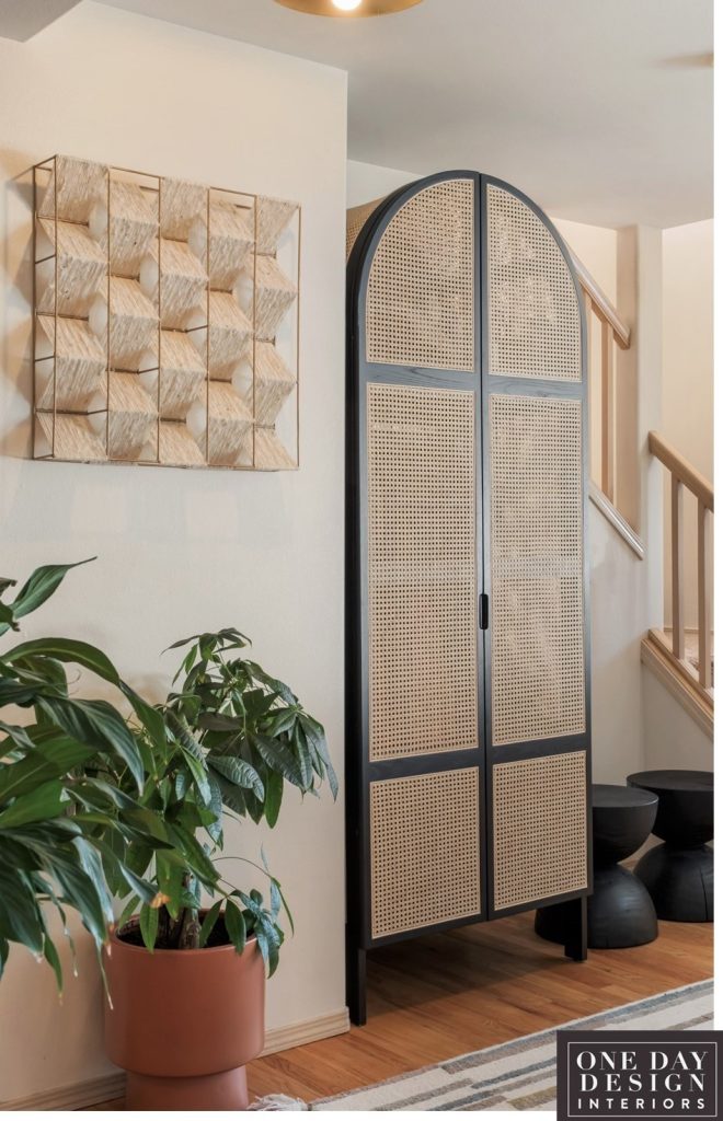
Another major “must have” was solving the problems of no covered storage and no seating in the entry.
They loved to entertain so both of those needs were constantly coming up.
Plus the entry was completely visible from the combined space, so decorating it was integral to the designed feel of the whole main space.
Storage Solutions: For coats, shoes, hats & purses
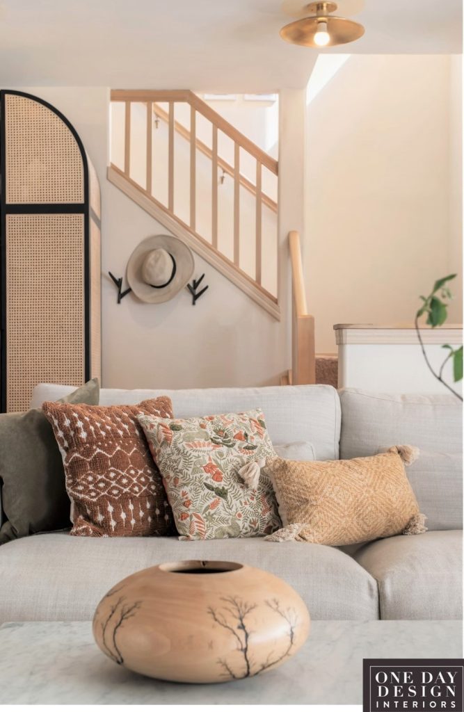
This Janpandi style natural cane and ebony coat closet solved the need for a beautiful storage solution. And even gave shoe storage with inside drawers and an upper shelf for hats and purses.
And we added several decorative hat and purse hooks to the space over the stools. (Hidden from view here but you can see it in the opening room photo.)
Seating Solutions
Next, we selected a decorative and unique solution for seating in a compact space. A pair of solid ebonized wood stools. (They were actually side tables but were tall enough to add the functional style we needed!)
Finishing Touches
The final touches were a modern woven wall hanging, and plants to bring in a natural, organic feel. And a hall runner to add a touch of pattern and practicality to the entry.
The Big Takeaway
Oh, and we were able to avoid the added expense of having an entryway closet built into the space by solving it another way… with furnishings!
Avoiding the Stress of Time-Wasting & Expensive Mistakes
Decorating and Remodeling Are a Lot Like Traveling
Having someone along who knows how to get you where you’re going makes for a whole different trip.
(Plus you arrive at the right place.)
Loved helping this couple with their first home and seeing it come together for them! Navigating through the project to avoid common problems let them skip the stress and enjoy rooms designed just for them.
If you’re ready to skip the stress
& enjoy rooms designed just for you
LET’S DO A QUICK DISCOVERY CALL
Tell us about your project & we’ll share if we can help and how
You can reach me at
425-977-5599 / office
or
4 Ways to Help You Love Your Home
QUICK DESIGN ADVICE
30 or 60 MINUTE VIDEO CALL
(Answers to your most pressing questions +feedback, ideas & design direction)
DESIGNER BY YOUR SIDE
DESIGN SUPPORT “AS NEEDED”
(Answers, ideas, & shopping on a project you’re managing)
FULL ROOM DESIGN
HAVE IT DONE FOR YOU
(From concept to curating furnishings to the reveal!)
COLOR CONSULTATION
INTERIOR & EXTERIOR COLOR PALETTES
(In-home/Seattle)
QUESTIONS OR READY TO BOOK?
You can reach me at
