Looking to Set a Certain Mood for 2023?
-There’s a Paint Color for That
After looking at the various “2023 Color of the Year” paint selections, I like Benjamin Moore’s “2023 Trends Palette” the best because it gives us a range of color trend options (along with a “Color of the year”). So, let’s look at those to see what you might love to see in your home!
But first, let’s look back for a moment at where we’ve come from in the last couple of years color-wise. You know, when we first started feeling the need to make our all neutral rooms less stark and more cozy by bringing color back into our lives.
We began to make that move by adding muted doses of soft greens and blues, blushes, even dare I say it, pale beiges, and creamy whites into our gray on gray, or very white, or black and white homes.
And the natural progression is many color trends have gotten brighter and now richer and deeper. They tend to be vibrant, earthy tones that will add a feeling of warmth and coziness.
But if when you look at the 2023 palette it feels overpowering, leaving you thinking “I could never live in a room like that!”
Here’s some advice to help you make the color leap if you want your home to feel more inviting and up to date:
Use color in smaller ways like in your decorating for your otherwise neutral room. Instead of thinking you have to paint a whole room in a color like you so often see when the new colors are introduced.
Just know they are often over the top to give us a very good idea I think as to what the color is like. Rather than the way we’d like to actually use it in a room.
You might actually love this inky blue trend in an accent wall or a sofa or just pillows on your neutral sofa.
These paint color trends, are also showing us interior color trends. So, think about too how you might incorporate them with decorating. Which would give you lots of options on how much of a color you want to add.
So, adding the new colors to your white or all neutral rooms in smaller ways is the perfect way to update your home and warm up your rooms and still have large neutral spaces if that is more your style. Or even if you just don’t want to start all over with your home.
And just think of all the ways you have to add color into your decorating:
- Art, throw pillows, accessories, plant pots, candles.
- Even as a color in a big beautiful patterned rug.
- Or one wall done in a fabulous wallcovering, whether that is wallpaper or a wall photo.
(My favorite wall photos right now are ones that look like big moody but subtle classical art as a backdrop for a mix of modern and classic furniture. Pure juxtaposition!)
Or even an accent piece of furniture in your neutral room like below with a coordinated dash of decor.
2023 Color of the Year & Palette
by Benjamin Moore
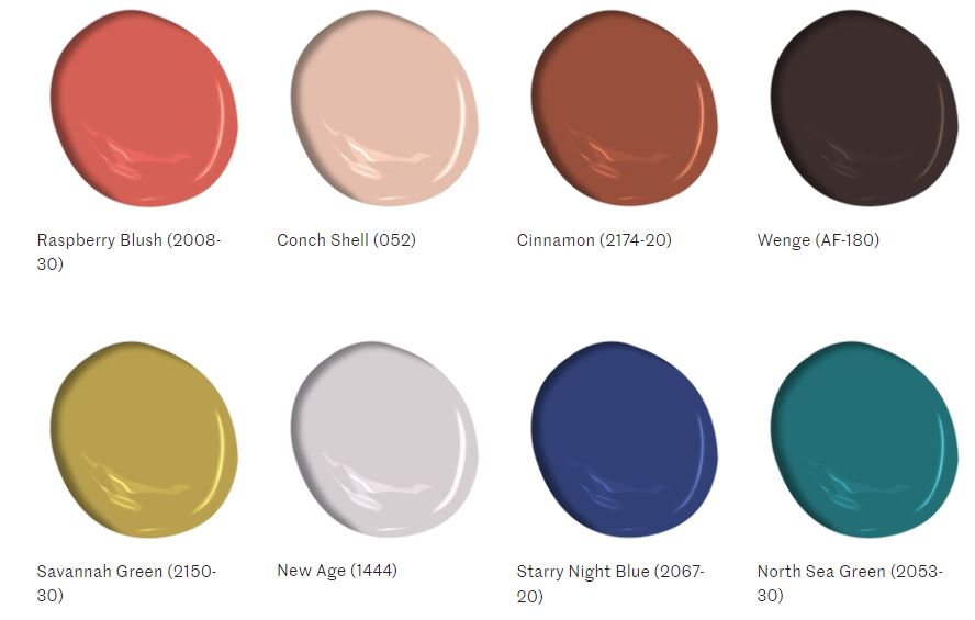
From vibrant, to deep organics to two softer shades
This palette offers many moods and combinations to work with. So, let’s look at each one and you can start to imagine what they might do for your home!
Starting with the “2023 Color Of The Year” in this palette:
Raspberry Blush 2008-30
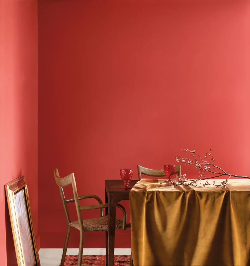
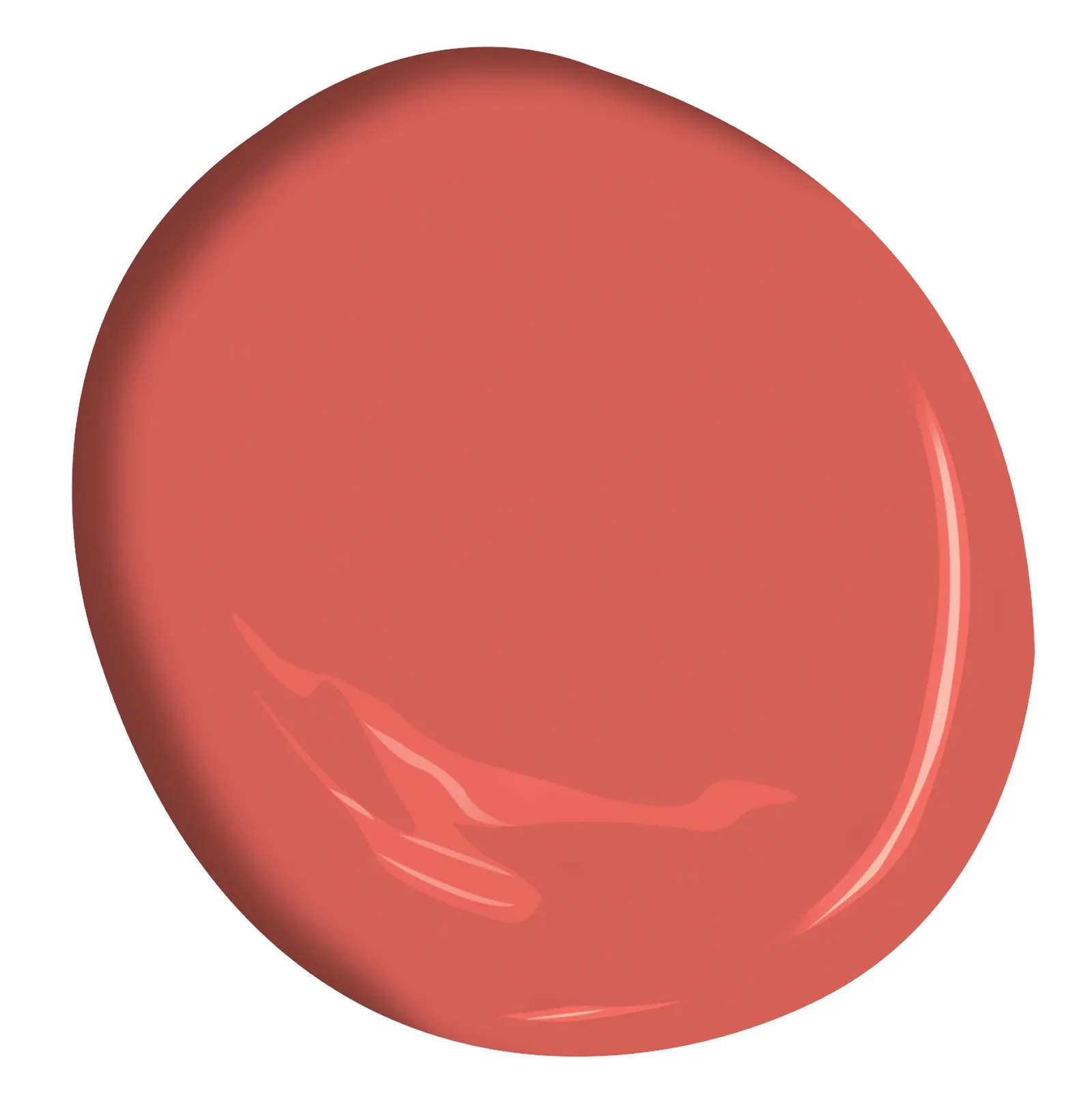
RASPBERRY BLUSH
-a lively, lovely coral with pink undertones
Like all color this can be used in different ways to create different moods.
- Used in a big way it will have a tropical feel to it that is fun and full of life. And will add significant color and warmth to your home.
- But in smaller doses in decorating, it pairs well with whites for a feminine feel.
- Paired with the palest gray it gives off a certain sophisticated look.
- Used with deep neutrals like Wenge in the 2023 palette (think dark chocolate) it is rich and moody.
- Brass, black & silver finishes work will well with Raspberry Blush.
Conch Shell 052
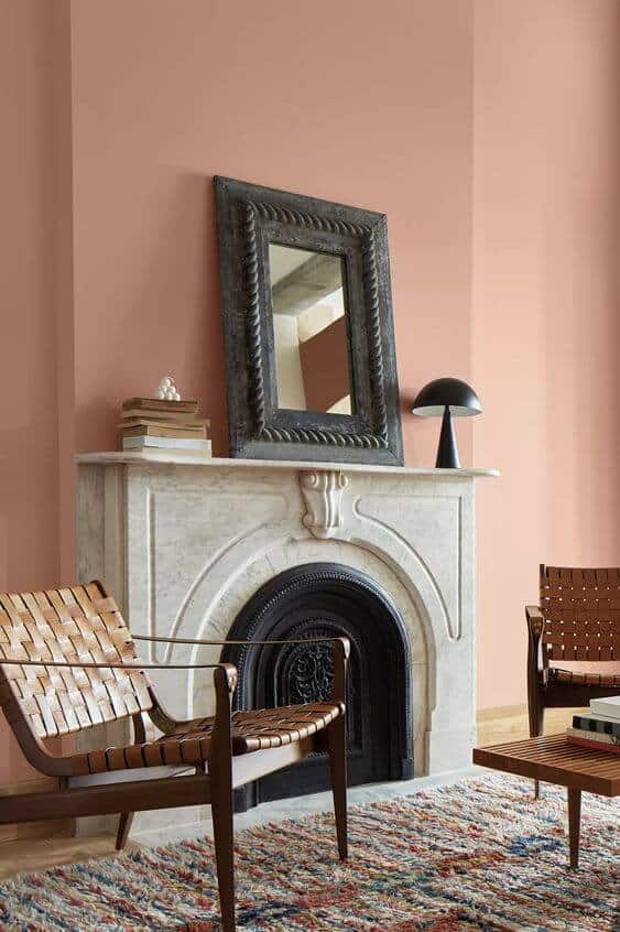
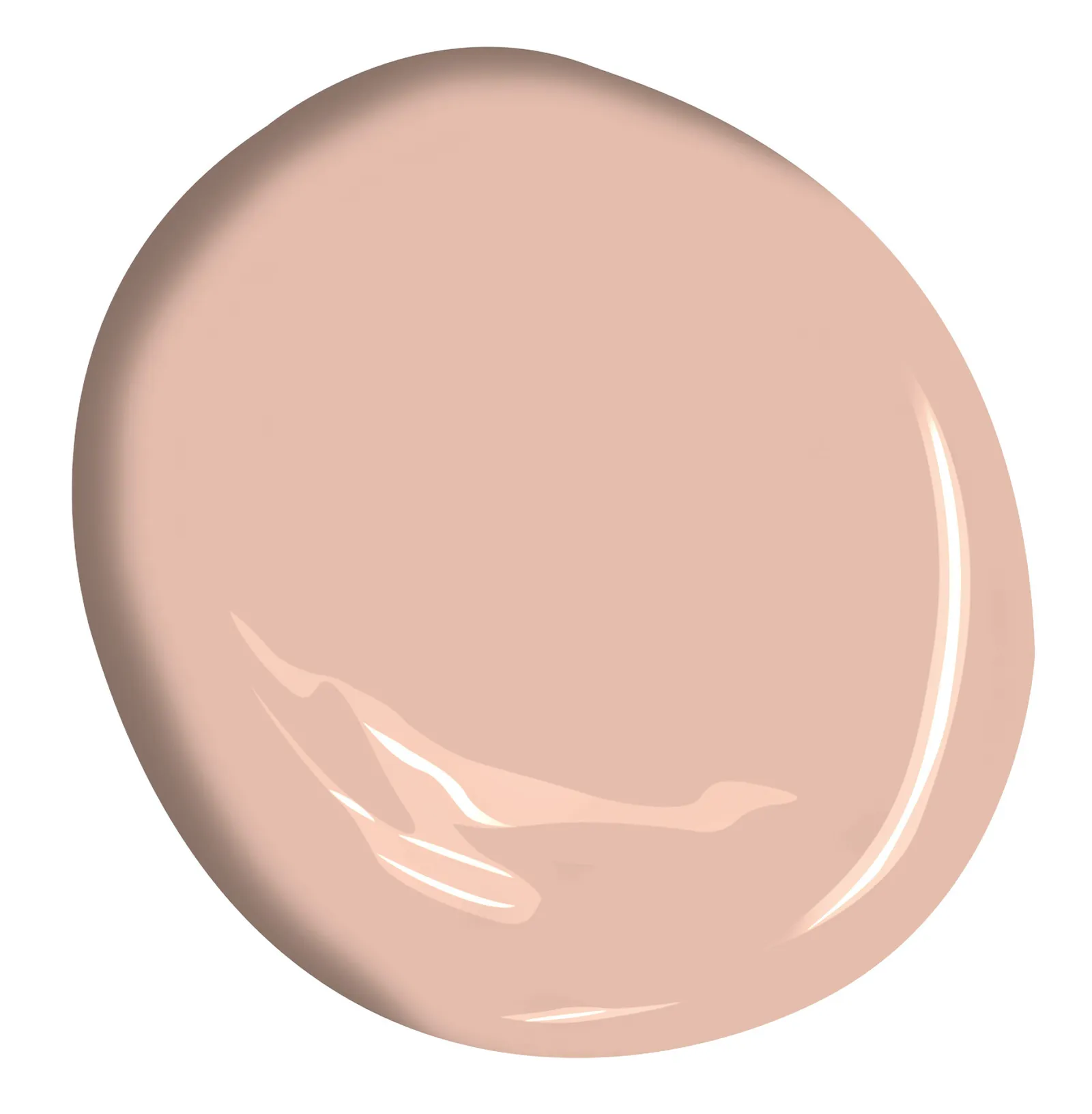
-a gentle peach-pink with a beige undertone
This cozy shade is great anywhere you want a warm and welcoming mid-tone color.
And it works beautifully paired with neutrals and muted colors like
- Very pale gray and/or white for a very soft look
- Cinnamon, dark chocolate or black for a more dramatic, sophisticated mood
- Greens, deep teals, and navy for a colorful vibe
Cinnamon 2174-20
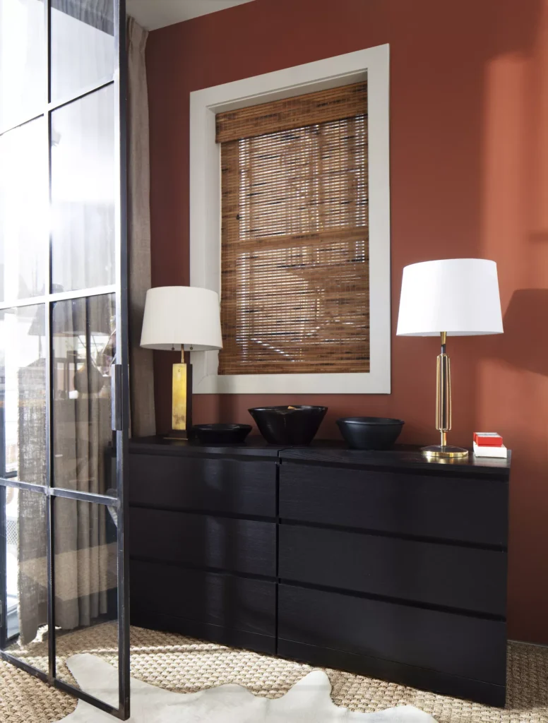
CINNAMON
-a toasty warm coppery brown with orange undertones looking well, just like cinnamon
And it can play SO many roles in a room:
- It’s a beautiful warm cozy color that can act like both a focal point color and a neutral.
- Making it also a perfect bridge between neutrals and more saturated shades
It’s beautiful accented with soft whites, vibrant bright green plants, and brass finishes, and optionally can be grounded with dark chocolate or black.
Black, brass & silver finishes will all work well with cinnamon, true to its versatile nature!
Wenge AF-180
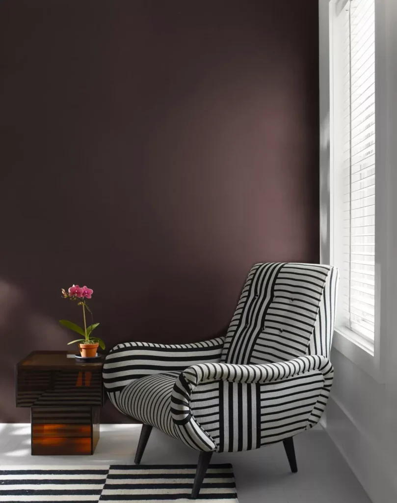
-a deep dark chocolate brown with a hint of black, brown & violet
It’s bold, it’s dramatic and will create a rich, dark space or can be used as a strong neutral accent in a light or colorful space.
Another very versatile hue, think of it as the new black.
Use it anywhere you would use black; it will have the same impact BUT with a welcoming warmth to it.
This velvety shade can create an elegant, bold ambiance in a dining room or powder room.
Even as an accent wall it will change the whole feel of a room with its strength of color.
Because it’s a neutral you can also use most other colors with it in any version.
(Just avoid another really deep color as they will get lost in each other, and the room will go too dark.)
To see how versatile Wenge is in pairing with colors if we just take green for example, here’s what’s possible:
- Very pale, muted greens will read as a high contrast, dramatic look.
- Lively bright greens like chartreuse will give off a fun, slightly edgy vibrant mood.
- Rich greens like olive will be a classic feel in a traditional room OR an organic vibe in a modern room.
- For flattering finishes, brass & silver work well with Wenge.
Savannah Green 2150-30
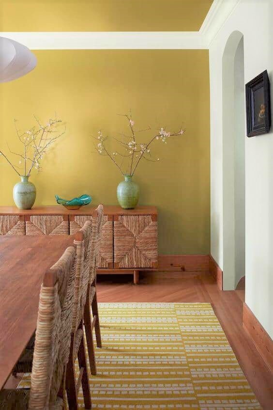

SAVANNAH GREEN
This ochre with green undertones can go organic to sophisticated depending on what you pair it with
For a deep, earthy vibe like above pair it with rich warm wood tones, natural textures and materials. (And I’d love the addition of large plants too), and off-white trim.
For a sophisticated vibe like below add it to a black and white room to make it more welcoming. The easy way to both update a neutral interior and create a warm and inviting feeling.
- This rich warm sunny color will especially play well in a room with a northern or eastern exposure.
- Think spaces like living or dining rooms, the main bedroom or a home office wall.
- Black, oil-rubbed bronze and brass finishes would all go well with it.
New Age -1444
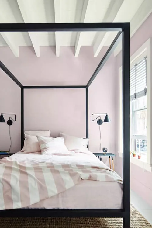
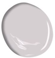
NEW AGE
A calming color, New Age’s light purple with a touch of gray is beautifully soothing
It would be ideal for a serene bedroom or bathroom.
- Another beautiful way to update a black and white room with just paint.
- Creating an inviting, yet relaxing, spa-like feeling.
- Black & silver finishes would work very well it.
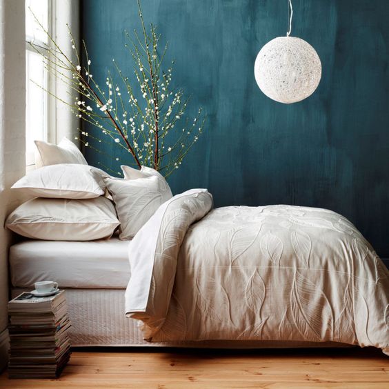
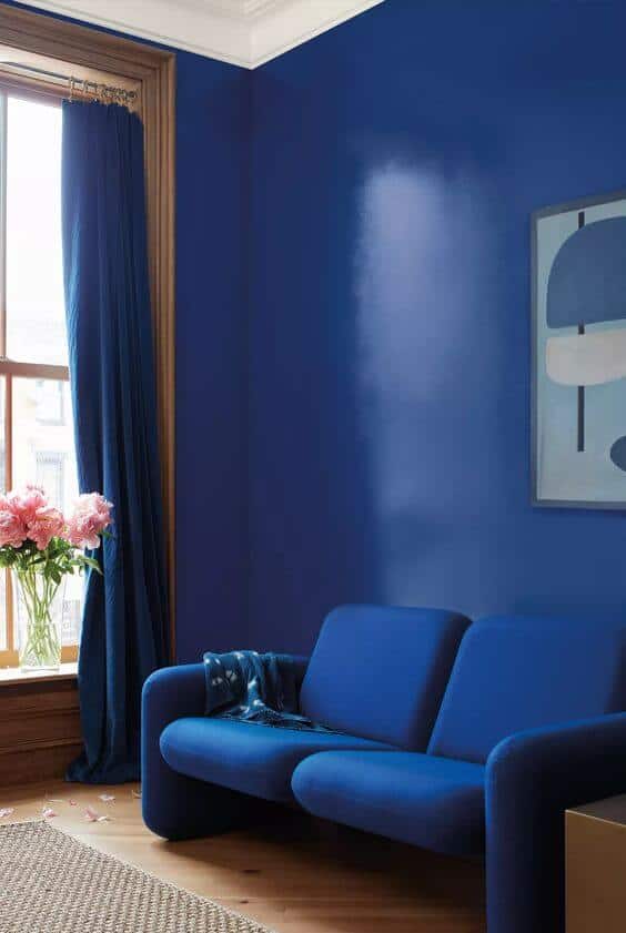
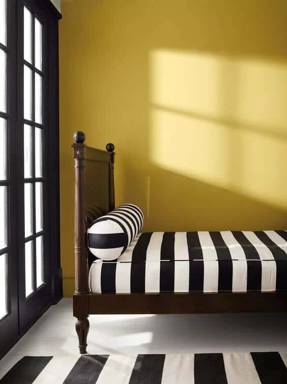
Starry Night Blue 2067-20
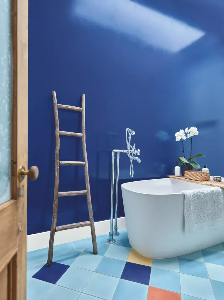
STARRY NIGHT
A chance to make a bold statement with this stunning inky blue with hints of violet
Or use it in smaller strategic ways to still enjoy the color and what it can do for your room like:
- Just paint it on the ceiling.
- Paint the inside of the bathroom door or the vanity.
- Add light-reflecting surfaces like glass, metal, and mirror(s) to accent it.
- Add oversized art with this deep blue in it, mounted in a thin black gallery-style frame.
- Brass & silver finishes will work beautifully with this color.
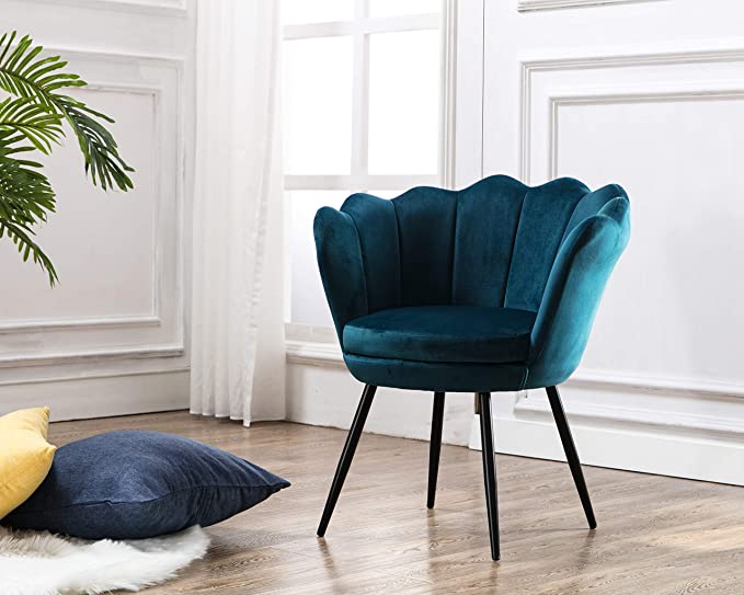
North Sea Green 2053-30
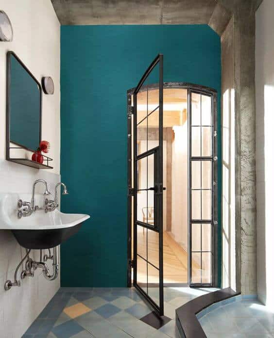

NORTH SEA GREEN
This color of the sea is very much on trend with its saturated teal hues
And the slight gray undertone give it a muted, less intense, wonderful moody feel.
It’s beautiful as an accent in this ensuite bathroom and would be just as beautiful in a dining room. Or an accent in a living room, the main bedroom or home office.
- Pairs well with a slightly grayed lilac, or coppery tone like Cinnamon.
- Another color to easily update your black and white room by adding it on an accent wall.
- Brass, Black & silver finishes would all work well.
Which of the new color(s) just makes you feel good?
The new year is the perfect time to add some “feel good” colors to your home!
Here are design steps to help you when updating your color palette for a cozier home:
- CHOOSING THE RIGHT ROOM
One that needs it the most?
One you spend the most time in?
One you’d have to do the least to?
- CHOOSING THE RIGHT COLOR(S)
What colors that you loved will go the best with what you are keeping?
Consider any undertones in both the new colors and your existing colors to be sure they will be good together. For instance, a golden undertone won’t feel good with a rosy undertone.
- CHOOSING THE RIGHT SCOPE
Would you do a little, a lot, or something in between to create the feel you want?
- CHOOSING THE RIGHT CHANGES
Where will you add the colors to make the most difference and look the best?
Paint:
A wall? Which one should be the focal point?
Every wall?
Is this room suited to a color on the ceiling?
Would the new color work with the flooring, trim window treatment colors, and any fireplace and cabinetry colors?
Decorating:
Where should you add the color: decor, artwork, accent furnishings, area rugs, wall coverings?
Once you’ve made your overall plan, you can start to make it happen by looking for the specifics.
If you feel you need help to be sure you are making the best decisions for adding color to your home we can help you any of these ways:
- COLOR CONSULTATION
-In-home, interior or exterior color palettes created - DESIGNER BY YOUR SIDE
-On-going design help as you need it NEW! 30 MINUTE DESIGN ADVICE VIDEO CALL
-Answers to your most pressing questions, & some added design direction
Wanting a fresh look that's cozy, comfy and stylish?
"DESIGNER BY YOUR SIDE"
will give you on-going Design Assitance as you need it
25+ years of creating comfy, inviting designer rooms;
simply start by telling us about your project
Call 425-977-5599 or
NEW!
Problem Space?
Get Quick Design Advice
30 MINUTE VIDEO CALL
Answers to your most pressing questions + design direction
Email your questions & room pictures to
mary@onedaydesign.com
$97
To Book:
Call 425-977-5599
or