I’m back designing for My San Diego Clients!
Since I last helped many of you with your home, my services have all become available remotely
Which means I am back working with my San Diego clients again!
Some of you have reached out to me on your own and so we have already teamed up again to create new living and dining rooms, home offices, and outdoor living areas.
And we’ve collaborated on kitchen and bathroom updates, with answers to your questions, feedback, and additional design ideas before you made your final decisions. Plus, getting guidance on color palettes and material selections and finding out the steps to follow for getting the best result on your project.
But I wanted to be sure that all of you knew about my remote option too, so thought I should do a better job of getting the word out 🙂
So, here’s a peek at several of these projects, and on the first one I’ll share the remote process we used as well.
San Diego Breakfast Nook Update
(Before & After)
A client I had enjoyed working with on a number of projects over the years while working in San Diego got in touch about wanting to decorate several spaces.
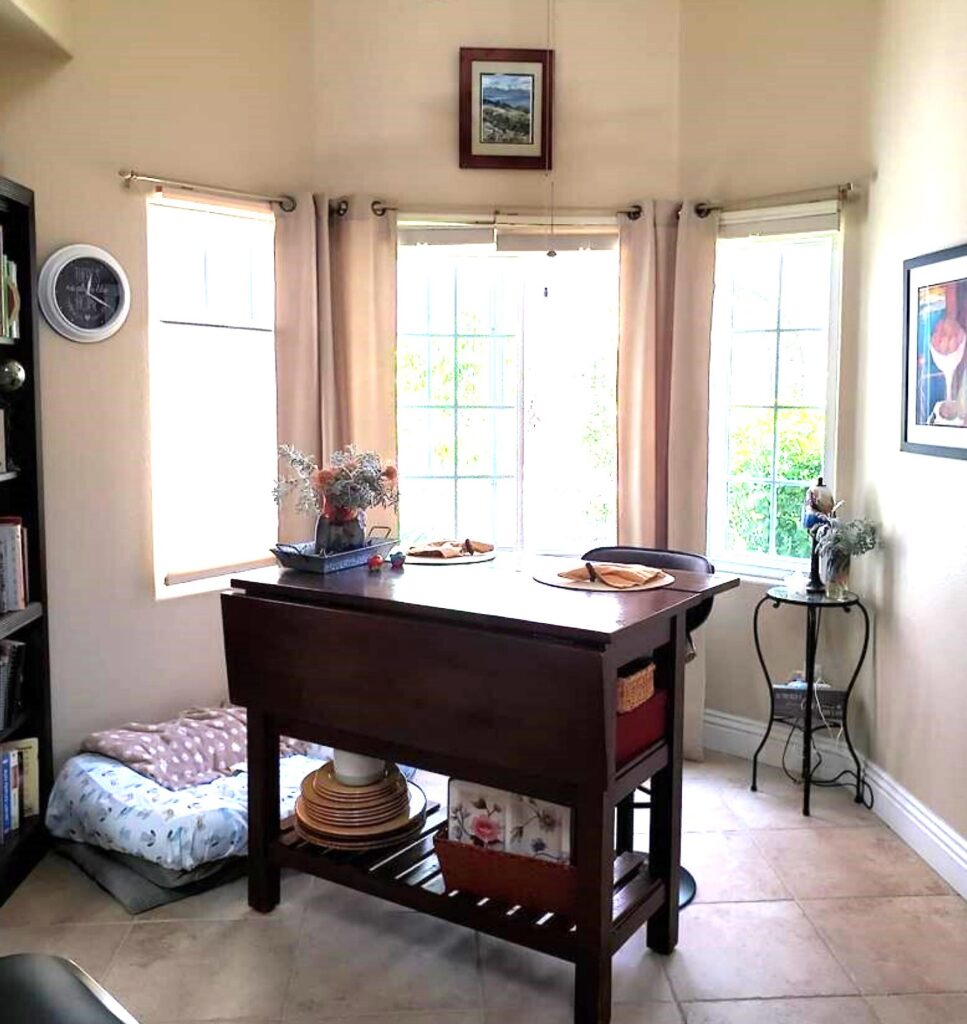
One was the nook off the kitchen, a space we hadn’t gotten to before. Which actually was a wonderful little space. We just needed to give it a fresh look and more functionality.
Here were the challenges and how we solved them
- Create a pleasing layout in a bay window floorplan.
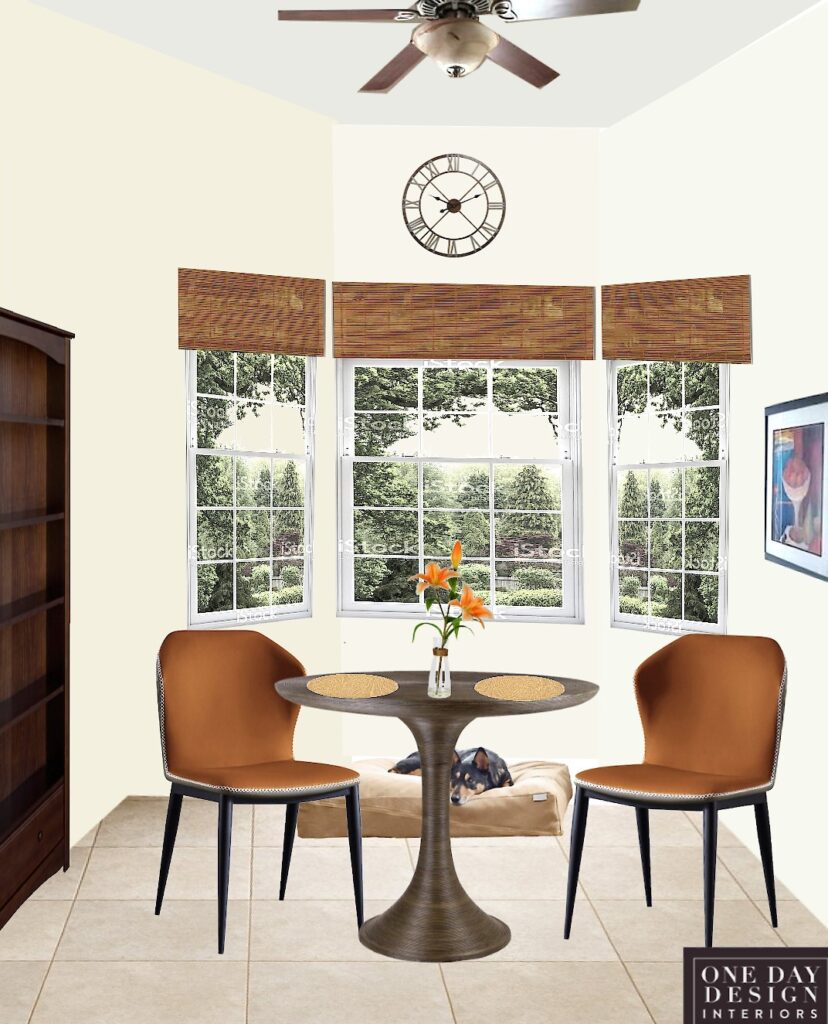
- A round table better fits the space shape
- Make the room feel lighter.
- Selected less bulky and lower dining pieces, so more outside light is let in the open view isn’t so blocked.
- Lightened (and updated) the wall color
- Be able to sit and see out while dining
- Round table made room for a better seating option to see outside and inside views
- Fit everything in (furniture & a large dog bed)
- Less bulky, round table allowed a more efficient arrangement: dog beds hidden more and out of the way of the pantry door on the left.
- Update the window treatments that would work with a bay window
- Woven wood cornices mounted above the window cozied up the tall wall and hid a decorative roller shade for light control and privacy when needed.
- Find a better place for a clock
- Again, took advantage of the tall wall space by adding a large decorative clock.
“AFTER”
Dining in Style
(From my wonderful client:)
“Love the format she is using and I am able to even shop for some of the items using links Mary provided… respected my budget and needs, as well as likes… definitely recommend…”
Here’s how we solved those design challenges remotely to create an updated breakfast nook
- VIRTUAL CONSULTATION We talked over the project on a Video Call while viewing her room photos together. And finding out her goals, challenges and must-haves, and any other project information she felt was important.
- CREATED THE CONCEPT Next, I started planning the overall look and feel of the space, deciding on the styles, colors, and layout to update the look. And just as important to add more functionality.
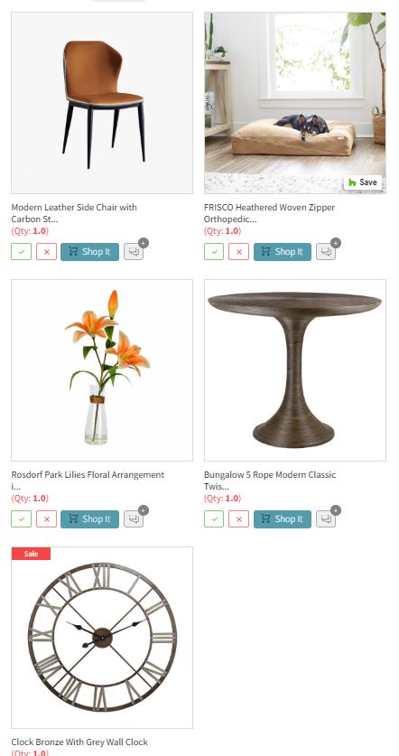
- CURATED THE COLLECTION Then, I selected the furnishings and decor online that would bring the concept to life, using retail and trade sources.
- CREATED THE DESIGN BOARDS & LINKED A SHOPPING LIST These are a set of virtual design boards (like the above “AFTER” of the finished look), that are complete with the selections and the placement layout. Letting the client easily see her nook’s new look and be confident in the selections before purchasing. Plus, a linked shopping list made shopping so easy. Everything shown on the design boards was just a click away from product details and purchasing.
Outdoor Space Decorated
(Before & After)
Another wonderful San Diego client got in touch to have their newly designed patio hardscape furnished.
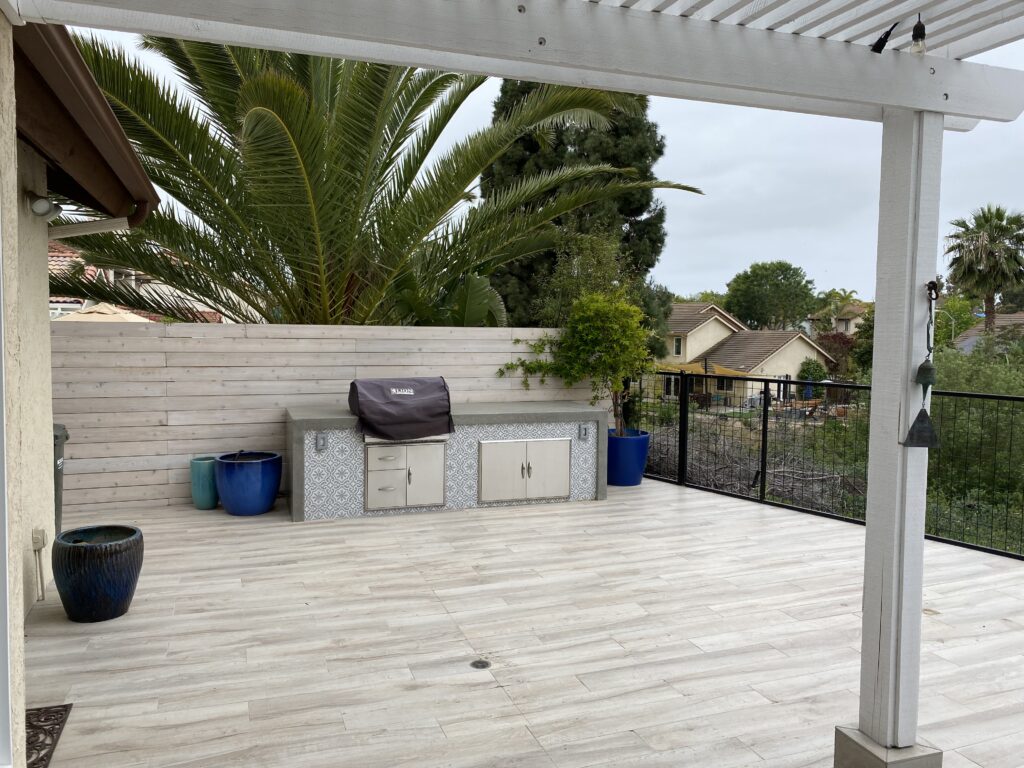
“BEFORE”
It can be hard to imagine what to do when looking at a big, empty space!
The Challenges:
- Complement the new (but existing) hardscape style and colors
- Needs to work for the two of them as well as for a group for entertaining.
- Be low-maintenance
- Chairs lightweight enough to move around easily
- Furnishings that will store easily for winter
- Create more privacy from neighbors
“AFTER”
A welcoming garden-like, outdoor living/entertaining dining space
(From my wonderful clients:)
“We’ve been thinking about furnishing a new patio for a year, but we were completely stuck because we didn’t want to make an expensive and irreversible mistake. Mary’s recommendations were perfect! We can move forward now that she has helped us understand what will work best in our space – YAY!!!”
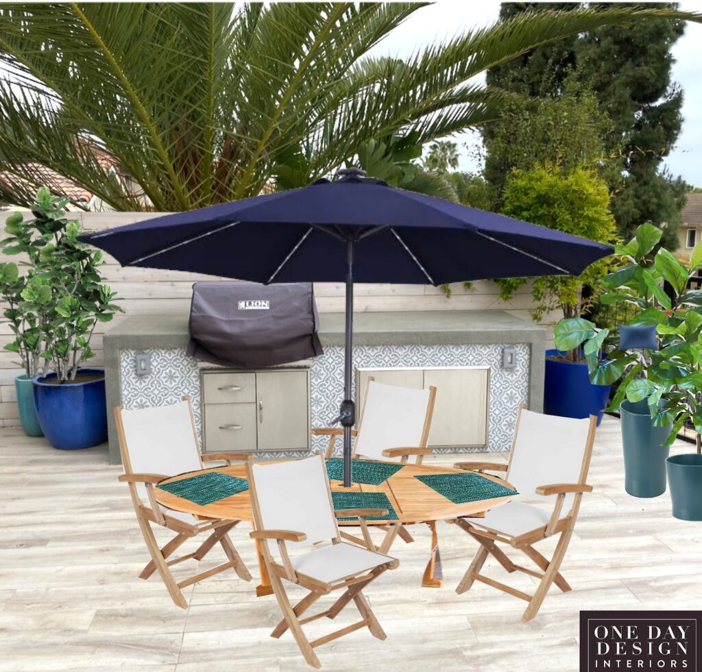
Creating an outdoor dining and entertaining space to coordinate with the new hardscape
- Used the encaustic patterned accent tiles colors to inspire the palette. <br>
- Warmed up the look at the gray hardscape by adding in a wood table and chairs.
- The rounded table also softened the look of the rectangles in the hardscape, and it was extendable with a leaf for entertaining bigger groups.
- Both the table and chairs were low maintenance, weather-resistant materials, and folded up for compact winter storage.
- The chairs were lightweight enough to move easily.
- Added additional large potted plants to add more colorful accents, soften the hardscape, and to create more privacy.
- (My clients opted not to do an outdoor rug, again for easy care, so it didn’t have to be maintained to keep it critter-free underneath. But rather let their new driftwood-looking flooring be a beautiful base for everything. Plus, the no-rug look added to the feeling of spaciousness.)
Dining Room Decorated
Next was a request to decorate a dining room that came from a San Diego client I’d enjoyed working with before.
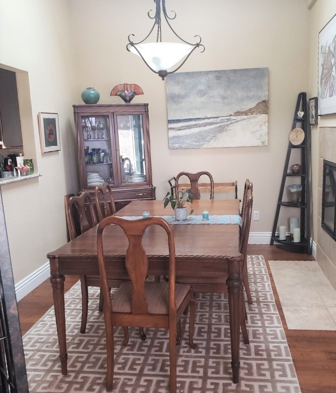
“BEFORE”
The goal was to make the room look coordinated and up-to-date while incorporating this classic table.
The Challenges:
- To create a coordinated look
- Refresh, and update the style of the space, making it feel less formal
- To create a lighter and a more spacious look
- Incorporate the existing traditional dining table
- Feature the art collection pieces to better advantage
“AFTER”
Feeling spacious, curated but coordinated in an updated eclectic classic style!
(From my wonderful Client:)
“I was having a hard time choosing what I liked and how to incorporate some of my items… Mary continues to be a fabulous resource…”
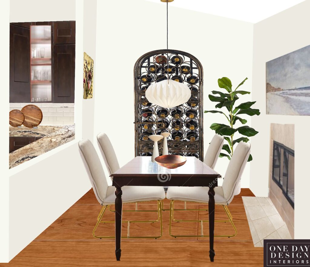
Creating an updated, more spacious, coordinated dining space around a classic table
- We used the color palette to create the look of a coordinated space:
Light and dark neutrals accented with a rich copper color and the green of a large plant. - Updated the style to “Modern Transitional” by adding modern pieces like the chairs, chandelier, and accessories to the traditional table.
- Lightened and updated the room with a soft, warm white wall color, chairs, chandelier, and accessories.
- Added the illusion of more space by not breaking up the flooring with an area rug and visually “borrowing” space from the adjoining wide walkway.
Incorporated a beautiful ornate wrought iron wine rack that was elsewhere in the home, using it as a fabulous focal point. (This meant removing a leaf from the table and adding it in when occasionally needed and extending the table into some into the open space at this end of the room.)
Contrasted the ornate black wine rack with a simple, white contemporary hanging light fixture that made a beautiful statement all on its own.
- A modern, simple tablescape offsets the traditional table to give the room a more informal feel.
- I also suggested the opening to the kitchen be enlarged to make both rooms feel bigger and the floor plan more open.
Kitchen & Dining Update
Here a client got in touch that we’d redecorated many rooms together in their former home. Now they’d downsized to a condo in a beautiful downtown San Diego location and were planning to renovate.
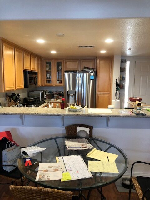
“BEFORE”
The kitchen layout worked well but the space was being taken back to the walls for a complete update.
The Challenges:
- The client knew the look she wanted and had chosen her cabinets but wanted help pulling it all together.
- Update the fixtures and finishes to coordinate with the white cabinetry the client had chosen.
- Update the color palette to coordinate.
- Update the flooring to coordinate with the kitchen and the whole main floor.
- Create functional and aesthetically pleasing lighting for the kitchen & dining.
- Maximize and update the adjoining dining area furnishings.
“AFTER”
A sleek, light modern look that’s a joy to behold and to use!
From my wonderful client:
“I highly recommend Mary Brown of One Day Design to virtually guide anyone through remodeling and redecorating… You don’t realize how many decisions are made …Her expertise was incredibly valuable;…”
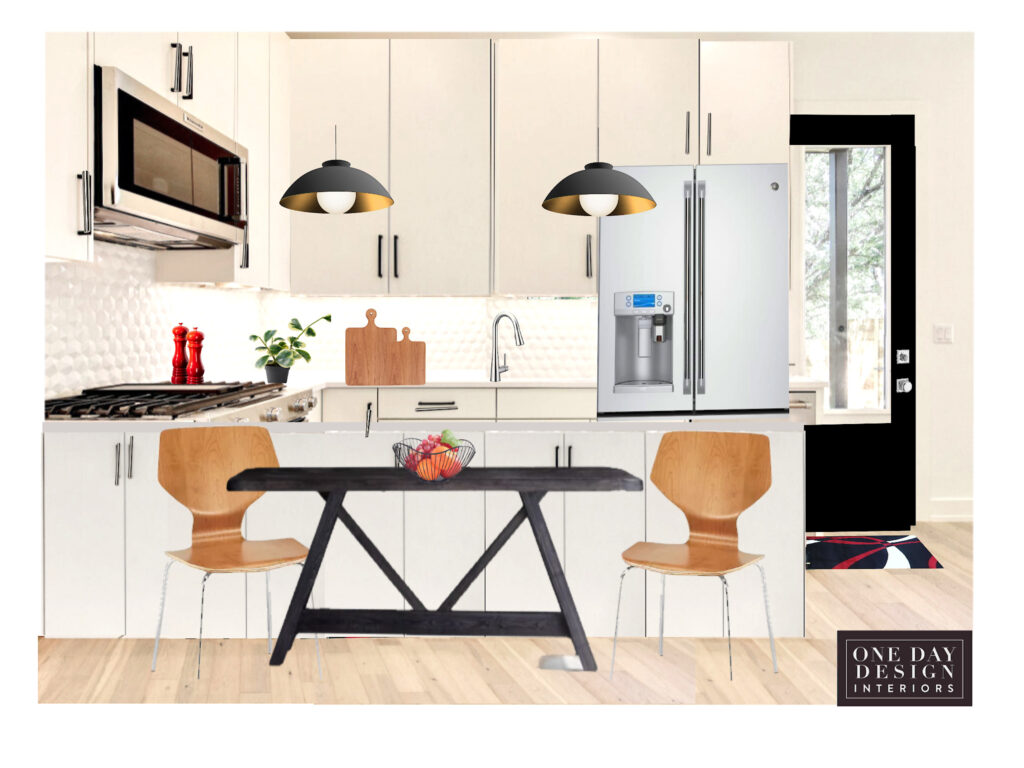
The client knew the look she wanted but needed design direction to pull it all together.
- Helping to guide the selection of fixtures and finishes to coordinate with the white Euro-modern cabinetry she had chosen.
- Giving feedback and additional ideas on the countertop, backsplash tile, cabinetry hardware sizing and placement and so many other design decisions that are part of a kitchen renovation.
- Like where and how to finish off the tile backsplash when the kitchen wall starts to become the dining space wall. Down to selecting and dry testing the grout color. (It changes after it dries just it paint.)
- We reviewed the flooring style and color to be sure it complemented the kitchen and the entire main floor.
- We discussed adding hanging decorative lighting over the peninsula to help balance out the recessed ceiling lighting. While also lighting the dining room table and visually separating the dining area from the kitchen. Plus, just the decorative look of the fixtures adds so much.
- In decorating the adjoining dining space, I suggested warm wood tones accents to warm up the crisp black-and-white look. And to a rectangle table shape to better fit the space.
If you have a project you’d like to work together on so you can make the best decisions for your home, I’d be happy to help.
You can reach me at:
Call 425-977-5599 /office
or
All the ways we can work together to make your home a place you love
QUICK DESIGN ADVICE
30 or 60 Minute Video Call
Answers to your most pressing questions, + feedback, ideas & design direction
DESIGNER BY YOUR SIDE
On-going design help as needed for answers, solutions, & shopping on a project you’re managing
FULL ROOM DESIGN
From concept to curating furnishings to styling and the reveal!
THE STYLED ROOM
Elevate your already furnished room (but don’t love) in just hours with a new virtual styling layout to look intentionally designed.
Plus ideas for any finishing touches needed, with online shopping available.
For any questions or to Book
you can reach me at:
425-977-5599 /office
or
